XY and Polar Line Plots
A line plot is the simplest type of graph you can produce with Tecplot 360. A typical line plot includes a dependent variable (usually the vertical axis for XY plots) and an independent variable (usually the horizontal axis for XY plots). Each line on the line plot represents one series of data points, where each data point is defined by its independent and dependent variable values. A series of data points is referred to as a mapping (or map, for short).
Tecplot 360 supports two types of line plots, XY plots and Polar plots. XY plots are plotted on Cartesian coordinates using X & Y as the independent and dependent variables (See Axis Variable Assignment). XY plots can include line, symbols, bar and/or error bar layers. Polar plots are plotted on polar coordinates using Theta and R values. Polar plots can include line and/or symbol layers.
An example of XY and Polar Line plots is shown below.
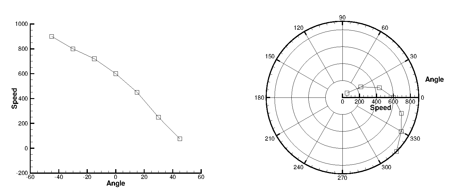
Line plots are usually created from one-dimensional, I-ordered data. The data used for line plots must have at least two variables defined at each data point. The same number of variables must be defined at each data point.
You can also create line plots from two or three-dimensional data in the IJ or IJK-ordered structure, or from finite element data by selecting "XY Line" from the plot type menu in the Plot sidebar. If "XY Line" is selected, finite element data sets will be treated as I-ordered (the connectivity list is ignored), IJ-ordered datasets will be treated as a family of J-sets of I-ordered data, and IJK-ordered datasets will be treated as K-planes of J-families of lines. Use the Indices page of the dialog to select different ranges and skip intervals for the I, J, and K-indices. See this section on ijk indices later in this chapter for more information.
When you first create a line plot, the Create Mappings dialog appears automatically so you can choose the mappings to be created (see Mapping Creation). Names, colors, symbol types, and line patterns are automatically assigned to each mapping. These and other line plot attributes can be changed using the pages of the dialog. To bring up the dialog, go to the menu and select "Mapping Style", or select the button on the Plot sidebar.
Mapping Style and Creation
Line plots are composed of the graphs of one or more pairs of variables (XY pairs in XY Line plots or Theta-R pairs in Polar Line plots). These pairs and their dependency relations are referred to as mappings. Mappings are defined for each frame; the same dataset can have a different set of mappings in each frame it is attached to.
Mappings can include any combination of the following mapping layers:
- Lines
-
Can be drawn as linear segments or curve that fit the data points.
- Symbols
-
Each data point is represented by a symbol.
- Error Bars (XY Only)
-
Error bars are drawn for each data point. The error bar value is determined by a third variable.
- Bar Charts (XY Only)
-
Each data point is represented by a vertical or horizontal bar.
XY Line plots can have up to five x-axes and five y-axes simultaneously. Polar Line plots can have only one Theta-axis and only one R-axis.
Open the dialog by clicking the Mapping Style button on the Plot sidebar to set attributes for lines and symbols and, in XY Line plots, bar charts and error bars. Initially, any linemaps selected in the workspace are selected in the Mapping Style dialog. You may also double-click a line in your plot to open the dialog with that mapping selected. You can set the style of any mapping independently of all other mappings.
| Each page of the dialog is divided into three color-coded regions. The blue columns (Map Number, Map Name, and Show Map) apply to the mapping itself and are repeated on each page. The green and orange columns represent primary and secondary settings specific to the selected mapping page. |

You can also use the line map context menu and toolbar to change some of these settings quickly and easily by right-clicking on a line on your plot. The toolbar allows you to turn on or off the line, symbol, and error bars for the selected line map by clicking the icons. You can also adjust the attributes of these (for example, line color, symbol shape, or error variable) using drop-down menus to the right of each icon.
Mapping Definitions
Existing mappings are edited with the menu’s dialog. From the Definitions page of the dialog, you can modify names, activate and deactivate mappings, assign axis variables, assign zones, sort data points in a mapping, control the mappings appearance in the line plot legend, and assign particular X and Y-axes to XY-line plots.
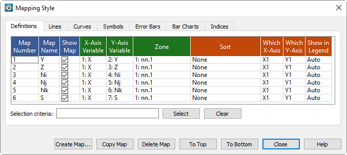
Some settings are represented by checkboxes, which can be toggled on and off by clicking them. Other settings require a right-click. In general, select the mapping or mappings you want to change, then right-click the selection in the column of the setting to be edited. Most of the time this will activate a pop-up menu; in other cases, a dialog appears. You may change mappings whether they are shown on the plot or not (activated or deactivated).
- Map Number
-
Displays the number of each map. This cannot be edited.
- Map Name
-
Double-click the map name to edit it. Type Enter to complete the edit or Escape to cancel without saving the edit.
- Show Map
-
Each mapping can be opted in and out of a plot by toggling the checkbox or by right-clicking and choosing one of the following options:
- Activate
-
Turns selected mappings on.
- Deactivate
-
Turns selected mappings off.
- Show Selected Only
-
Turns on selected mappings, and turns off all other mappings.
- Invert
-
Switches the current activation settings for the selected map(s).
- Axis Variables
-
The choice of variables is the heart of the mapping. Each mapping is defined by two variables: X and Y in XY Line plots and Theta and R in Polar Line plots. You may change the variables assigned to a mapping by right-clicking or double-clicking.

- Zone
-
Each mapping uses variable values from a specified zone. If your dataset has multiple zones, specify the zone for each mapping by right-clicking or double-clicking the displayed zone name.
The pop-up field chooser appears. Display a list of all zones by clicking the downward-pointing arrow next to the filter field, or start typing to display a filtered list of the zones whose name contains what you type.
- Sort
-
By default, mappings are sorted by the order in which they occur in the data file. You can change this order with the Sort option on the Definitions page of the dialog.
Choose from one of the following Sort options:
- None
-
Default behavior of sorting by the order in the data file.
- By Independent Variable
-
Points are sorted in ascending order of the values of the independent variable.
- By Dependent Variable
-
Points are sorted in ascending order of the values of the dependent variable.
- By Specific Variable
-
Select a variable from the dialog. The points of the selected mappings are sorted in ascending order of the values of this variable.
Only Line Segment and Parametric Spline curve types are affected by the Sort options. Splines are always sorted by the independent variable. See Curve Types for more information on curve types. - Which Axes
-
XY Line plots support five X-axes (X1-X5) and five Y-axes (Y1-Y5). Newly created mapping use the X1 and Y1-axes. You can change these assignments by right-clicking.
The ranges and scales for each axis are defined in the dialog (accessed via the ).
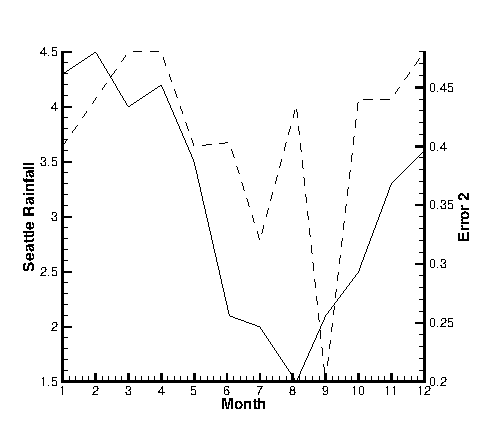 Figure 1. An XY Line plot using two Y-axes.
By default, the X1 axis is placed at the bottom of your axis grid area, and subsequent X axes at the top. Similarly, it places axis Y1 at the left of your axis grid area and subsequent Y-axes at the right. Thus, in Figure 1, the Seattle rainfall observations are shown along axis Y1 at the left of the axis grid area, while the error observations are shown along Y2 at the right.
You can also use multiple axes to cycle through mappings with different ranges or axis settings. You may find it convenient to assign different mappings to different axes so that you can set axis ranges, axis positions, or other axis attributes independently for each mapping.
- Show in Legend
-
By default, all active mappings appear in the line legend. However, the legend only lists mappings with identical entries once. (See Line Legend for details on the Line Plot Legend.) The button has three options:
- Always
-
The mapping appears in the legend even if the mapping is turned off (deactivated) or its entry in the table looks exactly like another mapping’s entry.
- Never
-
The mapping never appears in the legend.
- Auto
-
The mapping appears in the legend only when the mapping is turned on. If two mappings would result in the same entry in the legend, only one entry is shown.
- Selection Criteria
-
Enter a wildcard pattern and click to select one or more mappings based their name. In wildcard patterns, most characters match themselves, but the
*and?characters have special meaning.
| Character | Meaning |
|---|---|
|
Matches any single character. |
|
Matches any number of characters, including none. |
- Clear
-
Clear the selection and the pattern field.
Mapping Creation
To define a new mapping, select the button in dialog. The dialog also appears automatically the first time you choose the XY Line or Polar Line plot type. As shown below, the dialog is slightly different for the two plot types.
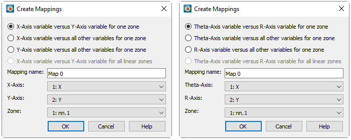
In XY Line plots, you have the following options:
- X-axis Variable versus Y-axis Variable for One Zone default)
-
Add a single mapping with one X and one Y-variable for one zone.
- X-axis Variable versus All Other Variables for One Zone
-
Create a new set of mappings using one variable as the X-variable and each of the other variables in the zone as Y-variables.
- Y-axis Var versus All Other Variables for One Zone
-
Create a new set of mappings using one variable as the Y-variable and each of the other variables in the zone as X-variables.
- X-axis Variable versus Y-axis Variable for All Linear Zones
-
Define one map for each zone, with the specified X-axis and Y-axis variables. If you choose this option, you specify only the X-axis and Y-axis variables.
The options for polar line plots are the same as above, but with respect to the Theta-axis and R-axis variables.
Specify the mapping name and the axis variables in the bottom section of the dialog. The default name is "Map n," where n is the number of the mapping to be created. If you are creating a mapping for one zone, you also select the zone here.
When you first load an ordered dataset, some mappings are automatically created for you. If your dataset has more than two variables, mappings are created that associate the first variable with each of the other variables for the first zone only.
| Selecting variables in a 3D finite element zone may require significant time, since the variable must be loaded over the entire zone. XY and Polar line plots are best used with linear or ordered data, or with two-dimensional finite element data. The defaults used in the Create Mappings dialog favor the types of zones that yield good performance. |
Mapping Names
Tecplot 360 automatically assigns a name to each mapping. The nature
of the name depends on the type of data used to create the mapping. If
your data has only one dependent variable, the default is to use the
zone name for the mapping. If your data has multiple dependent
variables, then the default is to use the dependent variable name for
the mapping. In either case, Tecplot 360 assigns each mapping a
special name (&ZN& or &DN& that is replaced
with the zone or variable name when the name is displayed.
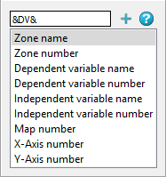
You can modify any mapping’s name by right-clicking the name of the mapping
in the Mapping Style dialog. A small window pops up to allow you to
enter a new name for the mapping, as shown here (note the default name
of &DN& in our example; our data has multiple dependent
variables, and the name of each is used as the mapping name).
You may add other dynamic text placeholders like &DN& to
the displayed mapping name by clicking one of the options below the edit
field, then clicking + (or simply double-clicking). The
placeholders will be replaced with the indicated value when the name is
displayed. By combining static text with these placeholders, you can
construct a name in any format you like.
The placeholders available in this window are:
- Zone name
-
Adds
&ZN&to the mapping name. This will be replaced with the actual name of the zone assigned to that mapping. - Zone number
-
Adds
&Z#&to the mapping name. This will be replaced with the actual number of the zone assigned to the mapping. - Independent variable name
-
Adds
&IV&to the mapping name. This will be replaced with the actual name of the independent variable assigned to that mapping. - Independent variable number
-
Adds
&I#&to the mapping name. This will be replaced with the actual number of the independent variable assigned to the mapping. - Dependent variable name
-
Adds
&DV&to the mapping name. This will be replaced with the actual name of the dependent variable assigned to that mapping. - Dependent variable numbe
-
Adds
&D#&to the mapping name. This will be replaced with the actual number of the dependent variable assigned to the mapping. - Map number
-
Adds
&M#&to the mapping name. This will be replaced with the actual number of the mapping. - X-Axis number
-
Adds
&X#&to the mapping name. This will be replaced with the actual number of the X-axis assigned to that mapping for XY Line plots. (This option is not available for Polar Line plots.) - Y-Axis number
-
Adds
&Y#&to the mapping name. This will be replaced with the actual number of the Y-axis assigned to that mapping for XY Line plots. (This option is not available for Polar Line plots.)
Map Layer
The Line map layer is available for both XY and polar line plots. Activate the layer by toggling-on "Lines" in the Plot sidebar. When the Lines map layer is on, the dataset is represented by a connected line for each mapping, which may be either a simple collection of line segments connecting all the data points, or a curve fitted to the original data.
Line Attributes
The Lines page of the dialog (accessed via the Plot sidebar or ) is shown below.
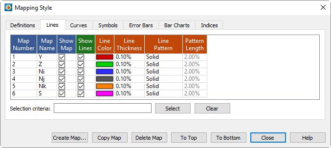
The first two columns, Map Number and Map Name, list the mapping number and the mapping name. The Map Show field lists which mappings are currently active. These columns behave the same as the corresponding columns on the Definitions page (see Mapping Definitions). The remaining columns of the Lines page of the dialog contain specific line attributes.
| In order for the changes made in the Lines page to be visible in your plot, the Lines mapping layer must be toggled-on in the Plot sidebar. |
- Show Lines
-
This option allows you to turn off lines for selected mappings, while keeping both the selected mappings and the Lines map layer active overall.
- Line Color
-
Set line color for line plots. Right-clicking displays the Color Chooser.
- Line Thickness
-
Set the thickness of lines. Right-clicking allows you to choose from preset line widths of 0.02, 0.10, 0.40, 0.80, or 1.50 percent, or enter any thickness using a dialog.
- Line Pattern
-
Right-click to choose line patterns for line plots.
- Pattern Length
-
Set the pattern length for patterned lines. Pattern length is measured as a percentage of the frame height for one complete cycle of the pattern.
| For information on using the controls at the bottom of the Mapping Style dialog to select mappings by name, see the description of these at the end of Mapping Definitions. |
Curve Types
Tecplot 360 offers a variety of curve-fits and spline fits. By specifying the curve type, you control how the data points are connected (see Map Layer).
Set the type of curve plotted for a mapping by right-clicking the desired Curve Type entry on the page of the dialog.
Tecplot 360 offers the following curve types:
- Line Segment (No Curve-fit)
-
A series of linear segments connect adjacent data points. In XY Line plots, these will be line segments.
- Linear Fit
-
A linear function is fit to the data points. In XY Line plots, this will be a straight line.
- Polynomial Curve-fit
-
A polynomial of order N is fit to the data points (where 1 ≤ N ≤ 10, for N=1 a Linear Fit is done).
- Exponential Curve-fit
-
An exponential curve-fit that finds the best curve of the form Y = eb*lnX+c (equivalent to Y=a*eb*X, where a = ec). To use this curve type, Y-values for this variable must be all positive or all negative. If the function dependency is set to X=f(Y) all X-values must be all positive or all negative.
- Power Curve-fit
-
A power curve fit that finds the best curve of the form Y=e_b*lnX+c (equivalent to Y=a*Xb, where a = ec). To use this curve type, Y-values for this variable must be all positive or all negative; X-values must be all positive. If the function dependency is set to X=f(Y), X-values must be all positive or all negative, and the Y-values must all be positive.
- Spline
-
A smooth curve is generated that goes through every point. The spline is drawn through the data points after sorting the points into increasing values of the independent variable, resulting in a single-valued function of the independent variable. The spline may be clamped or free. With a clamped spline, you supply the derivative of the function at each end point; with a non-clamped (natural or free) spline, these derivatives are determined for you. In XY Line plots, specifying the derivative gives you control over the initial and final slopes of the curve.
- Parametric Spline
-
Creates a smooth curve as with a spline, except the assumption is that both variables are functions of the index of the data points. (For example in XY Line plot, ParaSpline fits x=f(i) and y=g(i) where f() and g() are both smooth.) No additional sorting of the points is performed; the sorting specified on the Definitions page of the dialog is used for the order of the data points. This spline may result in a multi-valued function (of either or both axis variables).
- Extended Curve-fit
-
Uses a curve-fit supplied by an add-on. These curve-fits may be provided by Tecplot 360, a third party, or written by users. The functionality of each extended curve-fit is defined by its creator.
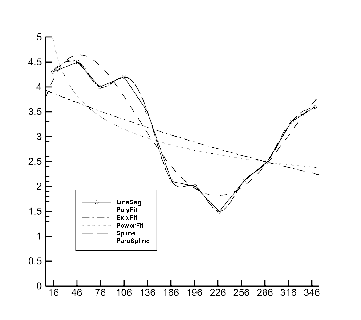
Linear Fit, Polynomial Fit, Exponential Fit, and Power Fit are all determined by using a least squares algorithm. Examples of each curve-fit type are shown in Figure 2.
The Curves page also contains fields for controlling the following attributes:
- Dependent Variable
-
Right-click to choose how curve fits and splines are interpreted. Dependent Variable has no effect on mappings of the Line Segment curve type.
- Curve Points
-
Controls the number of points used to draw curve fits and splines. Right-click to choose a preset number of points or to enter your own. Raising the number of points increases the accuracy of the curve but also increases plotting time and the size of print files.
- Curve Setting
-
Displays options specific to the curve type, such as weighting for curve fits or starting derivatives for splines. Right-click to set these options.
| For information on using the controls at the bottom of the Mapping Style dialog to select mappings by name, see the description of these at the end of Mapping Definitions. |
Linear Fit
Tecplot 360 fits the data to a linear function using the standard least-squares algorithm. It calculates the function for which the sum of the squared differences from the data points is a minimum. For the XY Line plot type, the linear function is a straight line.
To fit a linear function to your data, right-click in the Curve Type column on the Curves page of the dialog and select "Linear Fit." Then right-click in the Curve Setting column and choose Settings to display the Curve Fit Settings dialog, shown below.

- Polynomial Order
-
This is shown on the dialog, but should always be "1" for a linear fit. If you change this from 1, the curve type is changed to Polynomial Curve-fit.
- To limit the points used in the mapping(s)
-
select "Use Only Points Within Range", and enter minimum and maximum values.
- To assign a curve weighting variable
-
select "Use Weighting Variable", and select the variable from the drop-down. For more information on curve weighting, see Curve-fit Weighting Variables.
Polynomial Curve-fit
Tecplot 360 uses a standard least-squares algorithm to fit data to a polynomial function. You specify the order of the polynomial (from one to ten), and the polynomial for which the sum of the squared differences from the data points is a minimum is calculated.
To fit a polynomial function to your data, right-click in the Curve Type column on the Curves page of the dialog and select "Polynomial Fit."Then right-click in the Curve Setting column and choose Settings. The Curve Fit Settings dialog appears.
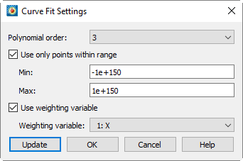
By default, this option fits a cubic polynomial, using all the points in the mapping and weighting them equally.
- Polynomial Order Drop Down
-
Select the desired polynomial order (1 to 10). An order of 2 is a quadratic polynomial, an order of 3 is a cubic polynomial, etc. If you select 1, the curve type is set to Linear Fit, as a polynomial of order 1 is a linear function. (See Linear Fit.)
- To limit the points used in the mapping(s)
-
Select "Use Only Points Within Range", and enter minimum and maximum values.
- To assign a curve weighting variable
-
Select "Use Weighting Variable", and select the variable from the drop-down. For more information on curve weighting, see Curve-fit Weighting Variables.
Exponential Curve-fit
Tecplot 360 fits the data to an exponential function using the standard least-squares algorithm.
| The dependent-variable values must be either all positive or all negative. |
- For XY plots (where X is the independent variable)
-
Tecplot 360 finds the best curve of the form:
Y=eb*X+c (equivalent to Y=a*eb*X where a=ec).
Similarly when Y is the independent variable.
- For Polar plots (where Theta is the independent variable)
-
Tecplot 360 finds the best curve of the form:
R = ±e(bθ+c)
or
R = ±αe(b*θ)
Similarly when R is the independent variable.
To fit an exponential function to your data, right-click in the Curve Type column on the Curves page of the dialog and select "Exponential Fit."
By default, this option uses all the data points in the mapping, weighting them equally.
Use the dialog dialog (accessed by right-clicking in the Curve Setting page on the Curves page of the dialog) to specify different settings. The dialog is shown below.
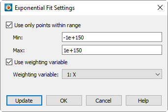
- To limit the points used in the mapping(s)
-
Select "Use Only Points Within Range", and enter minimum and maximum values.
- To assign a curve weighting variable
-
Select "Use Weighting Variable", and choose the variable from the drop-down. For more information on curve weighting, see Curve-fit Weighting Variables.
Power Curve-fit
Tecplot 360 fits a power function to data using the standard least-squares algorithm. The dependent-variable values must be either all positive or all negative, and the independent values should be all positive. Data points with zero or negative independent values are ignored.
- For XY plots (where X is the independent variable)
-
Tecplot 360 finds best curve of the form:
Y=eb*lnX+c (equivalent to Y=a*Xb where a=ec).
Similarly, when Y is the independent variable.
- For Polar plots (where Theta is the independent variable)
-
Tecplot 360 finds the best curve of the form:
R = ±eb*ln(θ)+c
or
R = ±α*θb
Similarly, when R is the independent variable.
To fit a power-curve function to your data, right-click in the Curve Type column on the Curves page of the dialog and select "Power Curve."
This option uses all the data points in the mapping, weighting them equally.
Use the dialog (accessed via the [Curve Settings] button) to specify different settings. The dialog is shown below.
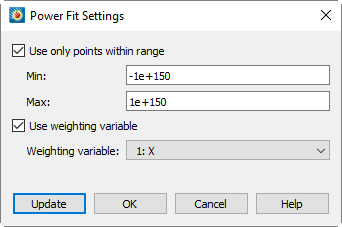
- To limit the points used in the mapping(s)
-
Select "Use Only Points Within Range", and enter minimum and maximum values.
- To assign a curve weighting variable
-
Select "Use Weighting Variable", and select the variable from the drop-down. For more information on curve weighting, see Curve-fit Weighting Variables.
Spline
A spline is a mathematical function defined to link a specified set of points with a function that is continuous and smooth (differentiable) at every point. The most common type of spline, the cubic spline, is defined using a set of cubic polynomials, one for each interval between the data points.
Splines can be natural or clamped: natural splines are twice-differentiable at the end points and the second derivative is zero at those points, while clamped splines have known first-derivatives at the boundary points. Before plotting the spline, the data points are sorted in increasing value along the independent axis.
| The Sort option of the Definitions page of the dialog has no effect on splines. |
To fit a spline function to your data, right-click in the Curve Type column on the Curves page of the dialog and select "Spline." By default, this option fits a natural cubic spline.
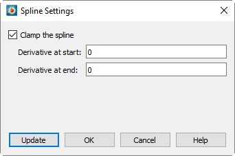
To specify a clamped spline:
-
Right-click in the Curve Setting column on the Curves page of the dialog and choose .
-
In the dialog (shown below), select "Clamp the Spline", and enter values for the derivative at the start and end of the spline.
Parametric Spline
The cubic spline fit assumes that the spline function is a single-valued function of the independent variable.
Sometimes, however, you have data that curves back upon itself, but you would still like to have a spline-like curve fit to it. Parametric splines solve this problem by presuming that both variables (X&Y or θ&R) are functions of the data-point index. The spline is then defined by two single-valued functions of the data-point index.
Unlike cubic splines, parametric splines are plotted in the order set in the Sort option of the Definitions page of the dialog. By default, the points are unsorted, and thus the spline is drawn in the order the data points appear in the data file. See Mapping Definitions for a discussion of sorting.
To fit a paraspline function to your data, right-click in the Curve Type column on the Curves page of the dialog and choose "ParaSpline."
By default, This option fits two natural cubic splines to the data point index.
To specify a clamped spline:
-
Select Para Spline from the Curve drop-down menu, and then select Curve Settings.
-
In the dialog (shown below), select "Clamp the Spline", and enter values for the derivative at the start and end of the spline.
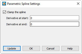
For the XY Line plot type, the derivatives are either dy/dx or dx/dy depending on the Function Dependency for the mapping. Tecplot 360 calculates dx/ds and dy/ds from these values (where s is the parametric variable). For the Polar Line plot type, the derivatives are either dR/dTheta or dTheta/dR (depending on the Function Dependency for the mapping), and dR/ds and dTheta/ds are calculated from these values (where s is the parametric variable). See Dependent and Independent Variables for a full description of the Function Dependency option.
Extended Curve-fit
Tecplot 360 add-ons can provide new curve-fit types. These curve types are called extended curve-fits. These curve-fits may be provided by Tecplot 360, a third party, or written by users. The functionality of each extended curve-fit is defined by its creator.
To fit an extended curve to your data:
-
Use the Curves tab of the dialog to select the mappings for which you want to apply an extended curve-fit.
-
Right-click , and select an option from the drop-down.
-
The extended curve fit options are located below the separation line (shown below).
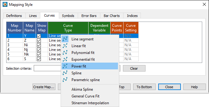
| Extended Curve fits can also be selected by the right-click context menu on a line plot. Simply right-click on the line you wish to change, hover over Curve Type, and a similar drop-down menu will appear as above. |
Three extended curve fit add-ons are supplied with Tecplot 360:
- Akima
-
The Akima spline is an alternative that exhibits less dramatic overshoots and undershoots than the classical spline. The slopes at the end of each segment are computed using a nonlinear average of the segment slopes.[1] The Akima spline is always unclamped. There are currently no options available for the Akima spline.
Extended Curve-Fit - General
The General Curve Fit add-on fits an equation composed of a linear combination of user-specified sub-functions to the data in the specified map. The optional parameters can be accessed by selecting the option on the page of the dialog.
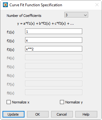
The curve fit computes (least squares) the optimal curve fit coefficients by multiplying these sub-functions.
The following options are available:
- Number of Coefficients
-
Specify the number of coefficients (and number of sub-functions) for the desired curve fit. The default is three. You must specify a sub-function for each coefficient in the text fields labeled f1(x) through fn(x), where n is the number of coefficients.
- f1(x) through f8(x)
-
Enter the sub-functions for the curve fit using the syntax described in Data Alteration through Equations.
| In these equations use the variable x as the independent variable, even if x is specified as the dependent variable in the option of the dialog. |
- Normalize X
-
Causes the curve to be fit using a normalized independent variable. In particular, the independent variable will be translated and scaled to vary from zero at the smallest value of the independent variable to one at the largest value of the independent variable. For most curves other than polynomials, this option will alter the shape of the curve fit. It is useful when you get the "Rank reduced for at least one curve fit" warning message, but otherwise is not recommended.
- Normalize Y
-
Causes the curve to be fit using a normalized dependent variable. In particular, the dependent variable will be translated and scaled to vary from zero at the smallest value of the dependent variable to one at the largest value of the dependent variable. For most curves other than polynomials, this option will alter the shape of the curve fit. It is useful when you get the "Rank reduced for at least one curve fit" warning message, but otherwise is not recommended.
Extended Curve-fit - Stineman
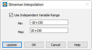
This method of interpolation generates a curve that will never have more inflection points than are clearly required by the given set of data points. The interpolating curve passes through the data points and exactly matches the computed slopes at those points[2]
The optional parameters can be accessed by selecting the option on the tab of the dialog.
Line Segment (No Curve-fit)
By default, a series of linear segments are drawn between each set of points for the XY Line plot type.
To turn off curve fits for your data and use linear segments between points:
-
The Curves page of the dialog, select the mappings you want to show as linear segments.
-
Right-click in the Curve Type column on the page of the dialog and select "Line Segments."
Line Segments are plotted in the order set in the Sort option of the Definitions page of the dialog. By default, the points are unsorted, and lines segments are drawn in the order the data points appear in the data file. See Mapping Definitions for a discussion of sorting.
Dependent and Independent Variables
Every mapping has a dependent variable and an independent variable. The dependency relationship determines the shape of your plot for most curve types. This dependency has no effect on line segment curve types, and for parametric splines, the dependency is only used to determine starting derivatives for clamped parametric splines. Extended curve-fits are free to use or not use this dependency depending on the type of curve-fit supplied.
You specify the dependency relationship between your axis variables by right-clicking in the column on the Curves page of the dialog.
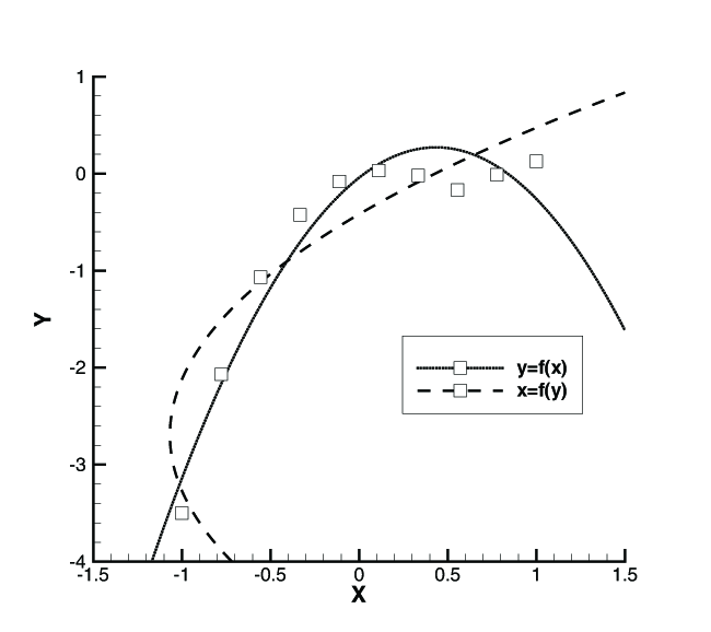
For the XY Line plot type, the default setting is y=f(x) (you may change the value to x=f(y)). With y=f(x), the X-axis variable is the independent variable and the Y-axis variable is the dependent variable. With x=f(y), the Y-axis variable is the independent variable and the X-axis variable as the dependent variable. Two polynomial curve-fits of the same data using different dependency settings are shown in Figure 3.
Similarly for Polar Line plots, the default setting is R=f(Theta) (you may change the value to Theta=f(R)). With R=f(Theta), the Theta-axis variable is the independent variable and the R-axis variable is the dependent variable. With Theta=f(R), the R-axis variable is the independent variable and the Theta-axis variable is the dependent variable.
To change the dependency setting:
-
From the Curves page of the dialog, select the mappings to change.
-
Right-click in the Dependent Variable column on the Curves page of the dialog choose either or .
| For the XY Line plot type, the dependency setting determines the direction of bar charts. To create a vertical bar chart, set the dependency to y=f(x); to create a horizontal bar chart, set the dependency to x=f(y). See XY Line Bar Charts. |
Curve-fit Weighting Variables
Linear and polynomial fits allow you to specify a weighting variable. By default each data point is weighted equally. With the weighting variable, individual points can be given more or less weight. Relatively larger numbers in the curve weighting variable mean more significance for a given point. If the curve-weighting variable is zero at a data point, that data point has no effect upon the resulting curve. Therefore if your data contains outliers that would affect the overall curve fit, adding a zero weight at the point of the outlier will remove it from the overall curve fit calculation.
The weighting coefficients must be integers in the range of zero to 9,999. Weighting coefficients defined as floating-point numbers are truncated. That is, a weighting coefficient of 1.99 is truncated to 1.0.
Curve Information
You can view information about curve-fits and splines by right-clicking the curve in the plot and choosing an item from the Curve Details submenu. The available functions include
- Show On Plot
-
Displays information about the curve directly on the plot, including the zone, the variables, the Goodness of Fit, and other information specific to the curve type (such as the polynomial for the Polynomial Fit type). This information is in a standard text element, and you can reposition it as usual, or change its appearance (its font, size, and color) using the dialog. It is automatically updated if you change the curve fit settings.
- Write Curve Points to File
-
Write the points of the curve to a Tecplot-format data file (.dat).
- Write Curve Details to File
-
Writes the same information displayed by Show On Plot to a text file. Note that this text file includes some Tecplot text formatting tags such as
<sup>.
Goodness of Fit
R2 is displayed in the curve details for linear, polynomial, exponential, and power curve fits. It is a statistical calculation that measures the success of the curve-fit in modeling the variation of the data. R2 is defined as the ratio of the sum of the squares of the regression (SSR) and the total sum of the squares (SST).
Where:
| Identifier | Represents |
|---|---|
SSR |
sum of the squares of the regression |
SST |
total sum of the squares |
Wi |
the value of the weight variable at index i |
yi |
the value of the dependent variable at index i |
ymean |
the mean value of the dependent variable y |
ycurvefit_i |
the value computed using the curve-fit at the i-index value of the independent variable (xi). |
i |
current index number |
n |
total number of data points |
| R-square can take any value between zero and one, with a value closer to one indicating a better fit. |
A fundamental error term in least-squares curve fits is the sum of the squares residual (SSE), defined by
This is the number that is minimized when computing the curve-fit coefficients. Using the equation SST = SSE + SSR, R2 can be related to SSE:
Using this form to compute R2, it is easier to see that an R2 closer to one (SSE=0) indicates a better curve-fit.
Goodness of Fit Residutal Degrees of Freedom Adjustment
One problem with R2 is that it
will always indicate a good curve-fit when the number of data points, n,
equals the number of degrees-of-freedom, m. (For example, a quadratic
curve-fit through three data points.) In this case, the curve passes
through all data points so SSE=0 and r-square=1. However, there are no
other data points so, in reality, no estimate can be made on the quality
of the curve fit away from the specified data points. In general, any
time m (degrees-of-freedom) is close to n (number of data
points), r-square will overstate the quality of the curve fit. For this
reason, we include the second goodness-of-fit parameter:
degrees-of-freedom adjusted
R2:
Like the standard R2, R2dof will vary from zero to one with values closer to one indicating a better curve fit. R2dof will be less than R2 when the degrees-of-freedom are close to the number of data points, but will be nearly equal to R2 when the number of data points is significantly greater than the degrees-of-freedom.
Symbols Map Layer
The Symbols map layer is available for both XY and polar line plots. Activate the layer by toggling-on "Symbols" in the Plot sidebar. When the Symbols map layer is on, each data point is represented by a symbol on the plot. For each mapping, you may choose the plotting symbol used, and whether to use filled or plain symbols.
Symbol Attributes
Use the Symbols page of the dialog (shown below) to modify the attributes of the Symbols layer.
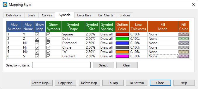
The first two columns list the mapping number and name. The Show Map column indicates currently active mappings. These columns behave the same as the corresponding columns on the Definitions page (see Mapping Definitions).
The remaining columns of the Symbols page of the dialog contain specific symbol attributes: Symbol Show, Symbol Shape, Symbol Size, Symbol Spacing, Outline Color, Line Thickness, Fill Mode, and Fill Color.
| In order for the changes made on the Symbols page to be visible in your plot, the Symbols mapping layer must be toggled-on in the Plot sidebar. |
- Show Symbols
-
Allows you to turn off symbols for selected mappings, while keeping both the selected mappings and the Symbols map layer active overall.
- Symbol Shape
-
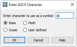
Right-click and choose a symbol type. In addition to the predefined symbols, you may use any ASCII character by selecting Character. Enter the ASCII character to use as a symbol in the dialog (shown below), and select a font from which to display the symbol. See Character Indices in Tecplot 360 for further information on the symbols available in each character set.
You can change the base font in the Scatter Size/Font dialog, accessible via . See Scatter Size/Font.
- Symbol Size
-
Right-click and choose the symbol size for your line plotting symbols. Symbol size is measured as percentage of the frame height. You can choose a preset size or enter your own.
- Symbol Spacing
-
Right-click to specify the spacing between symbols. The spacing is specified either as a percentage of the frame height or as a number of indices to skip. You may either enter a value or use a pre-set value.
- Draw All
-
Symbols are drawn at every data point.
- ISkip=2, 3 or 4
-
Symbols are drawn every second, third, or fourth data point.
- Enter Distance=1, 2 or 3%
-
Symbols are drawn at the first data point and subsequently at data points that are at least one, two, or three percent of the frame height distant from the previously plotted data point.
- Enter Index
-
Enter an index skip between symbols.
- Enter Distance
-
Enter a distance between symbols in frame units.
- Outline Color
-
Right-click to choose a color using the Color Chooser.
- Line Thickness
-
Right-click to choose the thickness of lines used to draw the plotting symbols. You may either enter a value or use a pre-set value.
- Fill Mode
-
Right-click to specify the Fill Mode:
- None
-
The symbols are not filled.
- Use Line Color
-
The symbols are filled with the same color specified in Outline Color and appear as a solid color.
- Use Back Color
-
The symbols are filled with background color of the grid area, and appear hollow, blotting out objects behind the symbol (such as grid lines or other mappings).
- Use Specific Color
-
The symbols are filled with the color specified in Fill Color.
- Fill Color
-
If the Fill Mode is set to "Use Specific Color", right-click in this column to choose the fill color in the Color Chooser.
| For information on using the controls at the bottom of the Mapping Style dialog to select mappings by name, see the description of these at the end of Mapping Definitions. |
Enter ASCII Character
Use the dialog to specify an ASCII character to use as a plotting symbol in either a field scatter plot or an XY symbol plot. You enter the desired character, and then choose the character set from which to draw the character. See Character Indices in Tecplot 360 for further information on the symbols available in each character set.

This dialog has one text field for specifying the ASCII character and four option buttons representing the available character sets, as follows:
- Enter Character to use as a Symbol
-
Enter the desired ASCII character in this text field.
- Base
-
Select this to use the English-text character set as the source of the plotting character.
- Math
-
Select this to use the math character set as the source of the plotting character.
- Greek
-
Select this to use the Greek character set as the source of the plotting character.
- User-defined
-
Select this to use the user-defined character set as the source of the plotting character. See Custom Character and Symbol Definition.
XY Line Error Bars
In the XY Line plot type, you can assign one or more variables to be used to compute error bars for another variable. Each mapping can be associated with only one error bar variable. If you want to assign multiple error bar variables to a mapping, create a copy of the mapping for each error bar variable.
An example plot with error bars is shown in Figure 4.
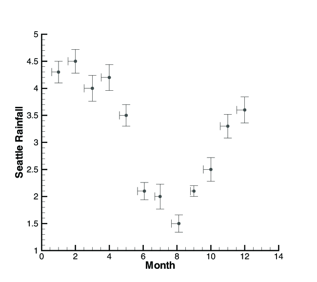
You can use any variable in your dataset as an error bar variable. However, for them to be meaningful, they should have the same units as the axis along which they are drawn.
NOTE: If error bar values are not included in your original dataset, you may create error variables using Tecplot 360’s data manipulation utilities. For example, if you know that the values of some measured variable are accurate only to within ten percent, you may create a new variable to use as the error bar variable by multiplying the measured variable by "0.10" via . See Data Operations.
Select Variable
Use the dialog to choose:
-
A single variable, as when assigning a variable to the X or Y-axis in an mapping. The text and labels will vary with the particular action being performed, but the operation of the dialog is the same in all cases. Select a variable from the drop-down of the dataset’s variables and select .
-
Two variables, as when assigning 2D axis variables or choosing 2D vector components. The text and labels will vary with the particular action being performed, but the operation of the dialog is the same in all cases. For each of the two variables required, select a variable from the drop-down of the dataset’s variables.
-
Three variables, as when assigning 3D axis variables or choosing 3D vector components. The text and labels will vary with the particular action being performed, but the operation of the dialog is the same in all cases. For each of the three variables required, select a variable from the drop-down of the dataset’s variables.
Error Bar Attributes
You can modify most of the attributes with which error bars are drawn—their color, their thickness, their spacing, and the width of the endpoint crossbars. You can make these changes from the Error Bars page of the dialog (shown below).
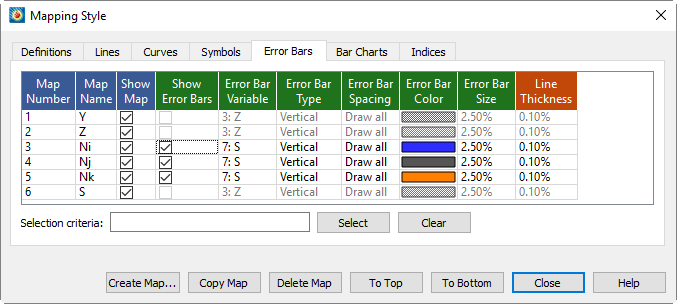
| In order for the changes made on the Error Bars page to be visible in your plot, the Error Bars mapping layer must be toggled-on in the Plot sidebar. |
The first two columns list the mapping number and name. The Show Map column indicates currently active mappings. These columns behave the same as the corresponding columns on the Definitions page (see Mapping Definitions). The other settings are:
- Show Error Bars
-
Indicates whether error bars are displayed for this mapping.
- Error Bar Variable
-
Right-click or double-click to choose the error bar variable.
- Error Bar Type
-
Right-click to choose from seven types of error bars.
- Up
-
Extends upward for positive values (and downward for negative values) of the error bar variable.
- Down
-
Extends downward for positive values (and upward for negative values) of the error bar variable.
- Left
-
Extends to the left for positive values (and to the right for negative values) of the error bar variable.
- Right
-
Extends to the right for positive values (and to the left for negative values) of the error bar variable.
- Horizontal
-
Extends left and right.
- Vertical
-
Extends up and down. (This is the default value.)
- Cross
-
Extends up, down, left, right.
Although the values are called Left, Right, Up and Down, the direction is determined by the direction of positive values in your plot. If you reverse the direction of an axis (using the Reverse Axis Direction option on the Range page of the dialog), the error bars point in the opposite direction. - Error Bar Spacing
-
Right-click to specify the spacing between error bars. The spacing is specified either as a percentage of the frame height or as a number of indices to skip. You may either enter a value or use one of the following pre-set values:
- Draw All
-
Error bars are drawn at every data point.
- ISkip=2, 3 or 4
-
Error bars are drawn every second, third or fourth data point.
- Distance=1, 2, or 3%
-
Error bars are drawn at the first data point and subsequently at data points that are at least one, two or three percent of the frame height distant from the previously plotted data point.
- Error Bar Color
-
Right-click to specify the error bar line color in the Color Chooser.
- Error Bar Size
-
Right-click to specify the size of the crossbar. Crossbar size is measured as a percentage of frame width. You may either choose a preset value or enter an exact value yourself.
- Line Thickness
-
Right-click to specify the line thickness of the error bars. The error bar line thickness is measured as a percentage of frame height.
| For information on using the controls at the bottom of the Mapping Style dialog to select mappings by name, see the description of these at the end of Mapping Definitions. |
XY Line Bar Charts
A bar chart is an XY Line plot that uses vertical or horizontal bars placed along an axis to represent data points. You can create bar charts by activating the Bars map layer on the Plot sidebar.
Bar Chart Attributes
The style of the bar chart is controlled on the Bar Charts page of the dialog, shown below.
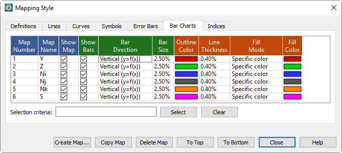
The first two columns list the mapping number and name. The Show Map column indicates currently active mappings. These columns behave the same as the corresponding columns on the Definitions page (see Mapping Definitions).
- Show Bars
-
Toggle on or off the bar chart for this mapping.
- Bar Direction
-
Right-click to change between vertical or horizontal bars.
Changing the direction of the bars changes the dependent variable attribute used for line curves (either y=f(x) or x=f(y)), and vice versa. By default, all mappings use y=f(x) and appear as vertical bar charts. If a mapping uses horizontal bars, the mapping will also use x=f(y) for curve fits. Of course, this only matters if you plot bars and curve-fits for the same mapping. For more information about dependency, see Dependent and Independent Variables.
To modify other attributes (Bar Size, Outline Color, Line Thickness, Fill Mode, Fill Color) on the Bars page, follow the same procedures used to set Symbol Attributes.
| For information on using the controls at the bottom of the Mapping Style dialog to select mappings by name, see the description of these at the end of Mapping Definitions. |
I, J, and K-indices
Each mapping can show either I, J, or K-varying families of lines. By default, Tecplot 360 displays the I-varying family of lines. Figure 5 shows the family of I-varying lines for Zone 1 of the data.
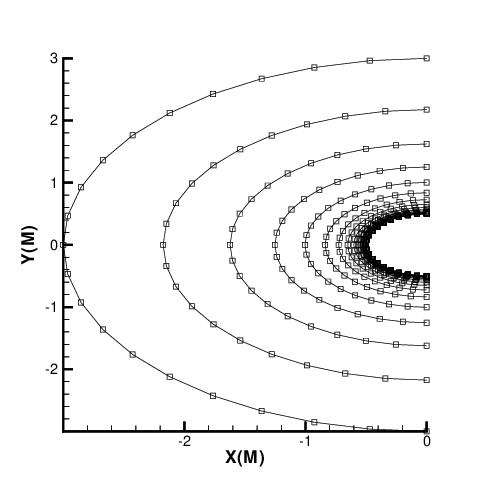
You can change the family of lines using the Indices page of the dialog as shown below.
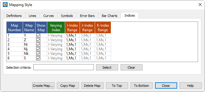
The first two columns list the mapping number and name. The Show Map column indicates currently active mappings. These columns behave the same as the corresponding columns on the Definitions page (see Mapping Definitions).
You can also choose which members of the family are drawn (and using which data points), by specifying index ranges for each of I, J, and K. The index range for the varying index tells Tecplot 360 which points to include in each line, and the index ranges for the other indices tell Tecplot 360 which lines in the family to include. Thus, you may use this option for selecting a subset of an I-ordered zone to plot.
- Varying Index
-
To choose the varying index, and thus specify the family of lines to be drawn, right-click the Varying Index column and choose the desired family (I, J, or K-varying). K-varying is only available if the mapping is using an IJK-ordered zone.
- Index Ranges
-
By default, the entire range of points is plotted in your mapping. For IJ- and IJK-ordered data, you may want to specify an index range to limit the number of lines drawn. Or, for any type of data, you may want to limit the points drawn to a select range. Right-click and choose Enter Range to specify the range.
Enter a starting index in the Begin field, an ending index in the End field, and a skip factor in the Skip field. A skip of one means "use every point in the range," a skip of two means "use every other point," and so on.
| For information on using the controls at the bottom of the Mapping Style dialog to select mappings by name, see the description of these at the end of Mapping Definitions. |
Line Legend
You can generate a legend that shows the line and symbol attributes of the mappings. In XY Line plots, this legend includes the bar chart information. The legend can be positioned anywhere within the line plot frame.
The mappings that are shown in the legend are selected on the Definitions page of the dialog. By default, all mappings are shown, but Tecplot 360 removes redundant entries.
To include the line plot legend, open the dialog (accessed via the menu) and toggle-on "Show Line Legend".
The dialog has the following additional options:
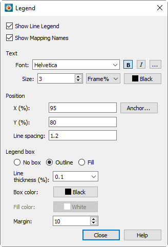
- Show Mapping Names
-
Toggle-on or off to include mapping names in the legend.
- Text
-
Format the text for the legend by choosing a color, font, and size. (See Font Folders and Fallback for more information on how fonts work with Tecplot 360.)
- Position
-
The legend is automatically placed for you. You may specify the position of the legend by entering values in the and text fields. Enter X as a percentage of the frame width and Y as a percentage of the frame height.
- Line Spacing
-
Spacing between items in the legend as a multiple of the font size.
- Anchor
-
You may also specify the anchor location of the legend using the dialog. By default, the legend is anchored in the top right.
- Legend Box
-
Choose No box, Outline, or Fill mode. If the legend box mode is Outline or Fill, the box attributes may be changed with the following controls:
- Line Thickness
-
Specify the line thickness as a percentage of frame height.
- Box Color
-
Choose a color for the legend box outline.
- Fill Color
-
Choose a color for the legend box fill (Fill mode only).
- Margin
-
Specify the margin between the legend text and legend box as a percentage of the text height.
Select Font
Use the Select Font dialog for your font preferences.
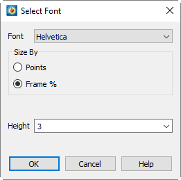
The available options are:
- Font
-
Choose a typeface from the drop-down. Some typefaces also have bold, italic, or bold/italic variants listed.
Not all fonts have Bold and/or Italic variants. For fonts that do not have these styles, the B and/or I buttons may have no effect. - Size by
-
Choose to size fonts by points or percentage of frame height, or in certain cases by axis percentage.
- Height
-
Select font height from the drop-down.
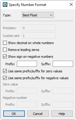
Specify Number Format
| Not all fonts have Bold and/or Italic variants. For fonts that do not have these styles, the and/or I buttons may have no effect. |
- Format
-
Choose the format for numbers in the legend from the drop-down:
- Integer
-
Display the number as an integer; if the exact value is not an integer, it is truncated.
- Float
-
Display the number as a floating-point number. The value is shown to the number of decimal places specified in the Precision field.
- Exponent
-
Display the number using FORTRAN exponential format (for example, 1.0125E + 02). The number of decimal places is specified using the Precision field.
- Best Float
-
Display the number as a floating-point number, with its exact form determined by Tecplot 360.
- Range Best Float
-
Tecplot 360 selects the best floating-point representation of the tick mark labels, taking into account the range of values on the axis. (Available only for axis labels.)
- Superscript
-
Display the number in scientific notation, using a number times a power of ten. The number of decimal places shown is specified using the Precision field.
- Custom
-
Not a number format at all, Custom specifies that a set of custom labels (specified by number in the Custom Set field) should be used in the contour legend. The first label in the set is used for the value one, the second label for two, and so on. All non-integer numbers are rounded to the nearest integer. If the number of levels exceeds the number of custom labels, the labels are reused cyclically as needed. For example, if you have defined the custom labels Mon., Tue, Wed, Thu, Fri, Sat, and Sun, then a value of eight would display Mon, nine would display Tue, and so on.
- Time/Date
-
You can specify a Time/Date format for your labels by selecting Time/Date from the Format drop-down menu. See Time/Date Format Options for more information on specifying your labels in Time and/or Date format.
- Precision
-
(Float, Exponent, or Superscript only) - Enter the number of decimal places each number is to show.
- Custom Set (Custom only)
-
Enter the number of the set of custom labels. You define custom label sets as records in standard Tecplot-format data files.
- Show Decimal on Whole Numbers
-
When this toggle is checked, whole numbers include a trailing decimal (that is, the number 2 is displayed as 2).
- Remove Leading Zeros
-
When this toggle is checked, leading zeros are removed from numbers (that is, 0.25 is displayed as .25).
- Show Sign on Negative Numbers
-
When this toggle is checked, negative numbers show the negative sign. When unchecked the negative sign will be removed (that is, -1.43 is displayed as 1.43). This is useful if you have specified a special prefix or suffix for negative values.
- Prefix and Suffix
-
You can specify a custom prefix and/or suffix for numbers in Tecplot 360 using the Prefix/Suffix text fields. Tecplot 360 allows you to specify separate prefixes and suffixes for zero values and negative values as well.