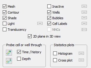
Grid Plot Controls
Since we provided the Tecplot RS sidebar with the goal of making plot attribute modifications trivial, the top of the grid plot types' sidebar naturally controls all plot layers, and the rest of the sidebar includes other important controls.
While the basic options available for grid plots are described in Basic Grid Plots, this chapter details the plot layers that Tecplot RS allows you to interactively add and subtract in any combination in the sidebar., as well as several other toggle switches included in the grid plot sidebars.
Plot Layers
Tecplot RS includes the following plot layers for grid plots:
|
Use the toggles in the top region of the sidebar to activate each layer. The Details … button next to the Light, Inactive, NNCs (2D Grid plots), Wells, Bubbles and, Cell Labels, toggles launches dialogs that you can use to customize your settings for the corresponding layer. Use the Plot Options dialog (accessed from the menu) to change global settings for each of the layers. You must turn on a layer to view its settings.
Mesh Layer
Toggle-on "Mesh" in the sidebar to add a mesh layer to your grid plot.
The mesh plot layer displays the lines connecting neighboring data points within a zone. For I-ordered data, the mesh is a single line connecting all of the points in order of increasing I-index. For IJ-ordered data, the mesh consists of two families of lines connecting adjacent data points of increasing I-index and increasing J-index. For IJK-ordered data, the mesh consists of three families of lines, one connecting points of increasing I-index, one connecting points of increasing J-index, and one connecting points of increasing K-index. For finite element zones, the mesh is a plot of every edge of all of the elements that are defined by the connectivity list for the node points.
To adjust the appearance of the Mesh layer on your plot, use the Grids page of the Plot Options dialog (accessible by double-clicking on your plot or choosing from the menu).
Contour Layer
You can use the contour layer to show variation of one variable across all cells. To add a contour layer to your plot, toggle-on "Contour" in the 2D or 3D Grid sidebar.
To change the type of color mapping used in the contour layer, use the Grids and Grid Legend pages of the Plot Options dialog.
Shade Layer
Although most commonly used with 3D grid plots, you can also use the shade layer to flood 2D plots with sold colors, or light source shade the exterior of 3D volume plots. In 3D plots, translucency and lighting cause color variation when you have the shade layer turned on. Shading can also help you determine the shape of a plot.
Toggle-on "Shade" to add shading to your 2D or 3D Grid plot.
Lighting Layer (3D Grid plots only)
You can enhance the shading of 3D grid plots by using lighting and translucency layers. To activate the Light layer, turn on the Light control in the sidebar.
Tecplot RS calculates the lighting as though the light source appears as a point of light far from the drawing area (so casting nearly parallel beams, as the sun does on the earth).
 Once you have
turned on the Light layer, you can use the Light Source tool to change the
position of the light source relative to your plot. To do this, after
turning on the Light layer, click the Light Source tool in the toolbar, and
drag in your plot to change the light source position. You can also see the
light position change reflected on the 3D orientation axes.
Once you have
turned on the Light layer, you can use the Light Source tool to change the
position of the light source relative to your plot. To do this, after
turning on the Light layer, click the Light Source tool in the toolbar, and
drag in your plot to change the light source position. You can also see the
light position change reflected on the 3D orientation axes.
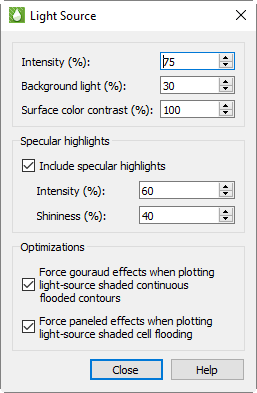
To adjust the effect that the light source has on your plot, click the Details button next to the Light control in the sidebar to open the Light Source dialog. In this dialog you can adjust the following settings.
Lighting Use these controls to adjust how extremely the light affects your plot.
-
Intensity Use this control to adjust how brightly the light source "shines" on your plot. A higher intensity value results in a "brighter" appearance. (An intensity of 100% produces maximum contrast between lighted and unlighted areas, and fully lighted areas use the full surface color.)
-
Background Light With this control, you can adjust the lighting effect applied to your entire plot, regardless the light source position. A higher background light value results a higher amount of light on all areas of your plot. A background light of 100% results in all areas lighted the maximum amount, and areas not lighted by the directional light source use full surface color.
| Intensity and background lighting act cumulatively; they can result in colors lightened beyond the base surface color. For example, for high values of both controls, reds may become pink and grays may become white. You may need to experiment with the controls to find the best setting for your plot. |
-
Surface Color Contrast Use this control to adjust the saturation of contour coloring in your plot under the light. A higher value results in more saturated colors. A surface color contrast value of zero results in a white plot before applying lighting effects (the plot will only appear in white and/or shades of gray).
Specular Highlights With this control, you can turn on/off the appearance of reflected light on 3D shaded or flooded objects. This affects all surfaces in your plot receiving light from the light source.
-
Intensity The intensity value controls the amount of specular highlights (that is, the amount of reflected light, which controls the amount of whiteness at the peak of the highlight).
-
Shininess The shininess value controls how shiny the highlighting is - the size and spread of the highlighting.
Optimization A few combinations of lighting type and plot style may result in slower redrawing of plots (especially larger plots). Tecplot RS provides the choice of which lighting method to use in order to avoid slower redraws. These optimizations are on by default. You may want to turn the graphics cache off before turning off these optimizations for plots with large amounts of data. See Graphics Cache for details on caching graphics.
-
Force Gouraud Effects This control forces gouraud shading under the circumstances described. Gouraud shading achieves smooth lighting by linearly interpolating a color or shade across a polygon. It offers a more continuous and smoother shading than paneled shading, but can result in slower plotting in some cases.
-
Force Paneled Effects This control forces paneled shading under the described circumstances. In paneled shading, the color within each cell assigned to each area by shading or contour flooding is tinted by a shade constant across the cell. Tecplot RS bases the shade on the orientation of the cell relative to the light source.
Translucency Layer (3D Grid plots only)
As noted previously, you can enhance grid plot shading by using lighting and translucency in your 3D grid plot. To make your plot translucent, enabling you to see the interior of the plot, toggle-on the "Transl" toggle in the Layers region of the sidebar.
| Tecplot RS automatically sets the Light, Shade, and Translucency controls whenever you choose an option that would activate or deactivate a see-through grid, including the Ghost option for inside views. |
Inactive Cells
To display the inactive cells in the active plot, toggle-on "Inactive" in the sidebar. If you have not loaded the inactive cells associated with the active grid, Tecplot RS will prompt you load them. See Loading Inactive Cells for details.
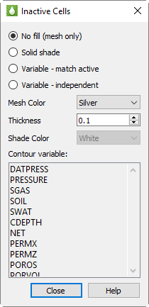
You can use the Inactive Cells dialog to customize the inactive cell display. Click the … button next to the Inactive toggle to launch the Inactive Cells dialog.
At the top of the dialog, you can choose whether to display the inactive cells as a simple mesh or shade, or whether to display a variable value:
-
No fill (mesh only) Choose this option to display the inactive cells as a mesh.
-
Solid Shade Choose this option to fill the inactive cells with a color.
-
Variable - match active Choose this option to color the inactive cells according to the solution data of the variable used by the active cells. If the inactive cells do not contain a value for that variable, they will display with a value of zero.
-
Variable - independent Choose this option to color the inactive cells according to solution data of a variable of your choice. If the inactive cells do not contain a value for that variable, they will display with a value of zero. Choose the variable you wish displayed from the Contour variable list.
In the next region of the dialog, you can specify the style of the mesh or shading chosen:
-
Mesh Color Choose the color of mesh displayed from the Mesh Color menu.
-
Thickness Enter a thickness value between 0.1 and 2.0 in the Thickness field to specify the width of the mesh lines as a percentage of frame size.
-
Shade Color Choose a color for inactive cell shading from the Shade Color menu.
When "Variable - Independent" is highlighted in this dialog, the Contour variable list becomes active. Choose a variable from this list to use this solution variable to color the inactive cells accordingly. If the grid data for the inactive cells does not include a value for that variable, the inactive cells will display a value of zero.
A portion of this dialog’s controls are also included on the Grids page of the Plot Options dialog (when "Inactive" is chosen on the left side of that page: see Inactive Cell Styles). Changes made in one dialog will be updated in the other dialog.
NNCs (2D Grid plots)
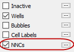
If your grid model includes Non-Neighbor Connections (NNCs), you can view them as a layer on your 2D Grid plots. For 3D Grid plots, choose "NNCs" from the drop-down menu in the Inside Views section of the sidebar. See NNCs for further details.
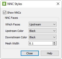
In 2D Grid Plots, a heavy line indicates NNCs, marking the upstream and/or downstream faces normal to the view plane. Click the … button next to "NNCs" in the sidebar to set the styles for NNC display. You can choose to display the upstream faces, downstream faces, or both. When both types are displayed, the overlap can cause interference, but selecting different colors can help differentiate the two.
To make NNC faces visible in 3D, Tecplot RS activates see-through grids when NNCs are activated. Use the Grids page of the Plot Options dialog to customize the See-Through styles.
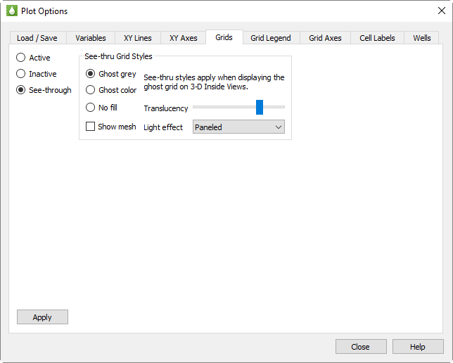
When the See-Through Style is set to "Ghost Gray", you can use the Light Effect to alter the appearance of the surface. Choose the "Paneled" Light Effect to get a better idea of cell boundaries (especially when the mesh is turned off), or "Smooth" to create a more rounded look. The "Smooth" option may load slowly on very large models.
Only NNCs within a grid display. NNCs between the global grid and LGRs, or those between two LGRs, are not highlighted, although the boundaries are still visible when translucency is on.
When NNCs are displayed, Tecplot RS displays a legend for the NNC variable. You can move or remove this legend by choosing the Paper Layout plot type and moving or deleting the RS_NNCVAR_(the legend title) and/or RS_NNCLEGEND (the legend itself) dynamic text items from the layout.
To adjust the legend, switch to the 3D Grid plot type and double-click the legend. The Grid Legend page of the Plot Options dialog appears; click the variable by which the NNCs are colored in the Variables list to modify the NNC legend settings.
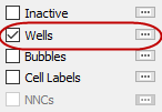
Wells
Toggle-on "Wells" in the sidebar to display wells in your plot.
Click the Details … button to bring up the Wells dialog.
With the options in the Wells dialog, you can limit the wells displayed to a subset of those in the file. This helps when you have so many wells in the reservoir that displaying all of them makes it difficult to see details.
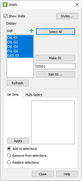
In the top region of the dialog, toggle-on "Show Wells" to display wells on your plot. This toggle matches the Wells toggle in the sidebar. You can also click the Styles button to modify the styles of your wells on the Wells page of the Plot Options dialog.
In the Display region of the Wells dialog, the box contains the list of wells from which you can highlight those you want to include. You can use the Select All button to highlight all wells. Use the Refresh button to apply your changes to the current plot.
Of course, if you have thousands of wells, choosing the ones you want to display from a box may not work efficiently. In this case, use Selection Sets.
To understand the basic concepts of selection sets, and how to create them using filters, read Filters, Selection Sets, Groups, Well Patterns, and Branches.
Within the Wells dialog, you can create new selection sets from the list of highlighted wells AND use existing selection sets to change those highlights.
To create a new selection set, start by highlighting the wells you want to include in the box (in the Display region of the dialog). Assign a name for the set (or use the supplied default), and click the Create button.
| Your current project file will store selection set information. To import selection set information from a project file, click the Manage button to bring up the Selection Set dialog, and click the Import button. (You can also open the Selection Set dialog from the menu). The import function will also load deprecated selection set files (*.rss), created with Tecplot RS version 2007 Release 1 or older. To do this, choose the version you wish to load from the Files of type menu in the Open File dialog. |
To use an existing selection set to alter your chosen list of wells, highlight the set you want from the box in the lower region of the Wells dialog. Choose a rule to follow for making the changes:
-
Add to selections Tecplot RS will highlight each well name from the selection set highlighted in the upper box, without disturbing existing selections.
-
Remove from selections Tecplot RS will turn off each well name from the selection set in the upper box, without disturbing other selections.
-
Replace selections Tecplot RS will modify all highlights in the upper list so that only the wells in the selection set will be highlighted.
Click Apply to use the selection set to alter the wells selected for display.
You can also use the pointer to change the highlighted wells. To do this, start by toggling-on "Wells" with the well labels (modify label settings in Wells page of the Plot Options dialog). This is necessary because you will be selecting the well labels with the pointer, rather than the well symbols.
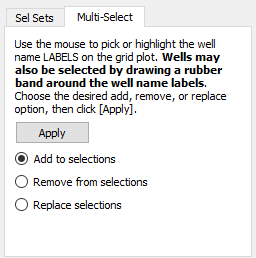
Switch to the Multi-Select page in the Wells dialog. Use the pointer to pick the wells. You can do this by rubber-banding a box around the ones you want, or by holding down Shift key and clicking individual labels. Just remember it is the labels (text) you want (any other picks will be ignored). As long as you hold down the Shift key, the well labels will accumulate.
Click Apply to use the picked wells to alter the well highlights.
| At this point, you may wish to create a selection set. Refer to Filters, Selection Sets, Groups, Well Patterns, and Branches for detailed information on selection sets. |
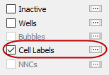
Cell Labels
|
For 2D or 3D Grid plots, toggle-on "Cell Labels" to include cell labels on your plot. You can use grid labels to display chosen data for the grid cells. By default, Tecplot RS labels each cell with its I-variable. Click the … button to launch the Cell Labels dialog, where you can choose another variable. |
Use the Skip field in the Cell Labels dialog to thin out cell labels. By default, Tecplot RS uses a skip value of zero. A value of zero designates an auto-skip mode, where Tecplot RS computes the skip value to produce approximately 100 total labels. The auto-skip mode usefully adjusts to grids with different numbers of cells or when switching between 2D and 3D views.
Use the Cell Labels page of the Plot Options dialog to customize the label formatting Cell Labels.
Bubble Plots
Bubble plots provide a way to display data for individual wells on a 2D or 3D grid plot. The well head symbol is replaced by a bubble that represents values for well data at the time defined by the time slider. The values may be historical, simulated, or even delta values computed between the two.
Bubbles are in the form of a pie chart with up to four different slices, one for each variable with each in a different color. Injectors and producers may be defined separately, so up to eight total values may be shown on the plot. Bubbles may also be sized according to a variable or even a sum of multiple variables. In this way, the pie slices display the relative quantities of two or more values, while the bubble size reflects the magnitude of a value.
To create bubble plots, you must have both XY and grid data sets loaded (refer to Loading XY Data and Loading Grid Data for details). Once you have loaded both sets of files, switch to a grid plot type and toggle-on both "Wells" and "Bubbles". Then use the … button next to the Bubbles to bring up this dialog:
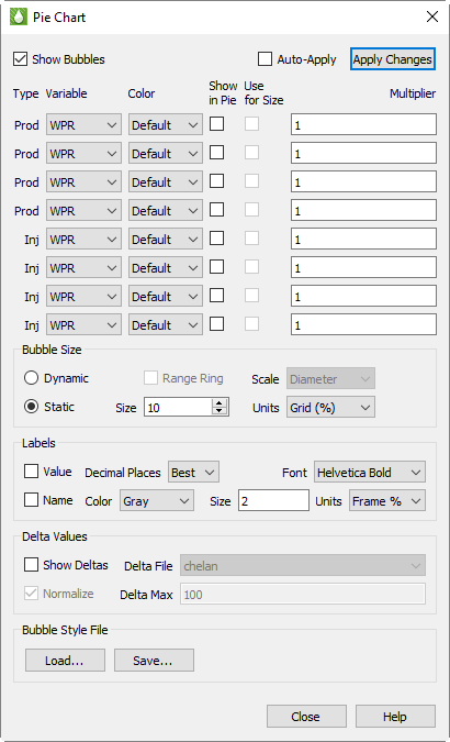
Prod and Inj
Note that the array of controls on the upper half of the dialog are divided into two groups for "Prod" (production) and "Inj" (injection) bubbles. Tecplot RS will create two separate sets of bubbles, and if both are to be shown you will need to limit your selections to variables that fall in the appropriate category. While there is nothing preventing you from selecting injection values in the production group, or vice-versa, if you mix the two you may get two bubbles plotted on top of each other, with the result being a "scrambled" image.
Variable and Color
For each bubble value to be shown, choose the variable and color. You may choose the color explicitly or select the "Default" option. This is the same as using the Default symbol color for XY line plots. The Default color is defined in the rsvariables.txt file, and can be seen/changed using Plot Options: Variables.
Multiplier
Each pie slice value will generally be measured in different units than the next. The Multiplier option can be used to balance or create equivalent units so that the relative size of one pie slice does not completely obscure the other.
Note that the multiplier is used for both the pie relative size and in the label for the pie slice value.
Show in Pie and Use for Size
Check the Show in Pie toggle to indicate that you want this variable to be included in the pie chart. You may select up to four variables within a Prod/Inj group to be shown.
The Use for Size toggle indicates that you want to use a variable to control the bubble size. Generally only one size variable will be chosen, but if you choose more than one then the sum of the values will be used to determine the size.
Bubble Size
The Use for Size toggle is active only when the bubble sizing is Dynamic, as controlled in these selections:
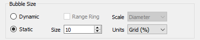
Choose Dynamic sizing when you want the bubble size to vary according to the values defined by the Use for Size checkbox. When only a single variable is selected in Show in Pie, you will almost always want to choose Dynamic sizing so that you can see changes other than what is reflected in the label. Static sizing will make all bubbles the same size.
When dynamic sizing is in effect, the Range Ring option will plot a hollow circle to represent the maximum bubble size, providing a visual scale for the current size vs. the max value for all wells over all times.
The Scale options include Diameter or Area, and this selection controls how the bubble is sized relative to the maximum size. For example, if the max value of the bubble size values is 1000 and the current value is 500, the bubble could be either half the diameter of the maximum size or half the area of the maximum, depending on this selection.
The Size and Units options control the actual dimensions of the maximum bubble size when Dynamic sizing is in effect, or the Static size if that option is chosen. Size may range from 1 to 20, and this value represents a percentage of either the frame size or the average dimension of the grid. If you choose Grid units, the bubbles will get bigger/smaller when you zoom in or out on the view. Frame units will keep the bubble sizes constant relative to the frame. The latter is usually the better option when there are many wells, since you can zoom in and eliminate overlap.
Labels
Each pie wedge can be labeled with the value and/or name of the variable being shown. The labeling options are shown here:
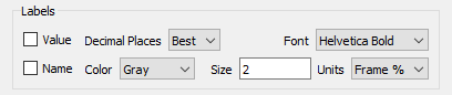
As with the bubbles themselves, you can choose sizing units for the labels that will either zoom with the grid or remain fixed relative to the paper/frame.
Delta Bubble Plots
Bubbles can also display delta values - the change in a value between one dataset and another. This may be historical data vs. simulated, or the difference between two different simulations.
When the Show Deltas toggle is checked, you will be limited to showing a single variable value, and bubble sizing is automatically switched to dynamic so that the bubble size will reflect the magnitude of the value. The Delta File controls will display the list of loaded XY files from which you can choose the one used to calculate the differences.
Bubbles will be shown in the selected color when the delta value is positive, and in white when the change is negative.
You must also choose a value for the Delta Max, which is the value that scales to the maximum bubble size. Larger deltas will be clamped at that size. A sample use case for this is when any value greater than this max is equal cause for concern, but you want more granularity to see the lesser values.
If you toggle on Normalize, the size of the delta bubbles will represent the magnitude of the difference between the Active Data Set and the comparison data set divided by the value of the Active Data Set.
Bubble Style Files
Bubble styles are saved as part of the project file and will be remembered when the project is reopened. You can also save just the bubble styles in a separate file. This makes it easy to share the styles between projects or to create your own custom style to be used as a default starting point for new projects. Use the Save and Load buttons to accomplish this.
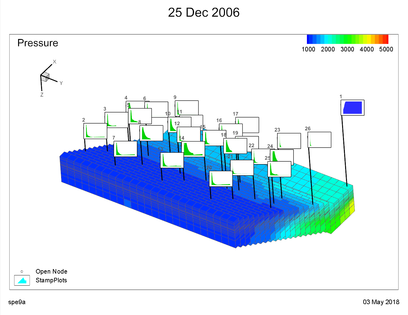
Stamp Plots
Stamp plots provide a way to compare well production and injection data on a 3D grid plot. This gives a spatial view of these data, allowing the engineer to determine those regions of the reservoir that are performing well or poorly. When stamp plots are shown, each well symbol is replaced by a miniature line plot of the selected property appropriate for the well type at the current time step.
To create stamp plots, you must have both well (XY) and grid data sets loaded (see Loading XY Data and Loading Grid Data for details). Switch to the 3D Grid plot type, and turn on the "Wells" toggle. Then use the … button next to the Stamps option to display this dialog:
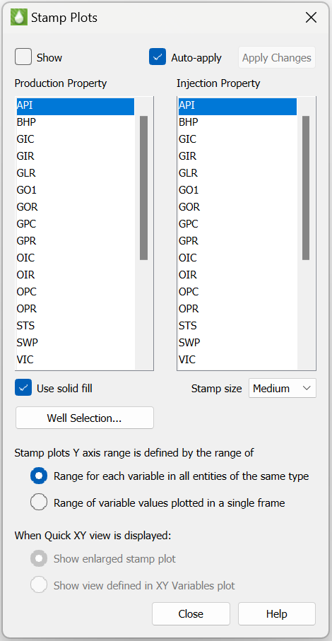
The list of properties comes from the Well data set. You may choose one property for production data, and another for injection data. Which property is shown for the stamp will depend on the status of the well at the time step determined by the slider on the sidebar. So if a well changes from a producer to an injector partway through the simulation, you will see the stamp change to the other property when you move the slider.
You can select from small, medium, or large sizes for the stamp plots. The stamps may be drawn as a simple line or a filled area with the "Use solid fill" toggle. The range for the vertical axis will be set to the min/max values of the displayed property over all times and all wells. This allows you to compare how wells perform relative to each other. For production properties, the color will be according to your settings in plot options. For injection properties, the color will be determined by the well type (red for gas injectors, blue for water or generic injectors).
When the "Time/history" toggle is selected and you Ctrl+Left-Click on a well, the XY view is displayed using one of the following options:
-
Select "Show enlarged stamp plot" to display a larger view of the XY plot shown in the stamp. This option will display the Time/history plot using the production and injector property selections in the Stamp options dialog so that the XY view is an "enlarged" version of XY plot displayed in the stamp.
-
Select "Show view defined in XY Variables plot" to display an XY plot using the property settings from the XY Variables plot type. If this option is selected, the Time/history plot may not match the stamp if the properties selected in XY Variables is different that the property selections in the stamp plot dialog.
You can use the Well Selection… button to choose which wells, and thus which stamps, are displayed on the plot. The Auto-Apply checkbox, when turned on, will instantly apply your selections to the plots as you make them. If you have a large number of wells, it may be helpful to leave this off and use the Apply Changes button to see the results after making multiple changes.
Additional Data Views
You can quickly incorporate another view of your grid data by using one of the following toggles in the sidebar:
-
Statistical Plots, in the menu, give additional methods to view data.

|
These data views have options to select either a cell or well. The current selection mode is shown in the sidebar. The crosshair containing the box is for cell probing. The crosshair with the well is for the well probing mode. |
Stamp plot Y-axis range may be defined in one of two ways:
-
"Range for each varaible in all entities of the same type". This setting is the default and uses the Y-Axis range across all entities of the same type. This setting gives a common Y-Axis scale for each stamp and allows comparison of all stamps using the same range.
-
"Range of variable values plotted in a single frame". This setting is typically used when a stamp plot contains negative values. The Y-Axis range will encompass the range of variable values in a single stamp. This option gives the best "zoomed in" view of data in a single stamp, but is not recommended for comparing stamps since each stamp will be displayed using a different scale.
Time/History
When you toggle-on "Time/history" in the sidebar, Tecplot RS reduces the size of the first frame to make room for another frame. The pointer also changes to a small crosshair with a box denoting the pointer is in cell probe mode.
Use the pointer to choose any cell in the grid. A line plot will fill the new frame. This graph represents the displayed grid variable for the chosen cell over all time steps.
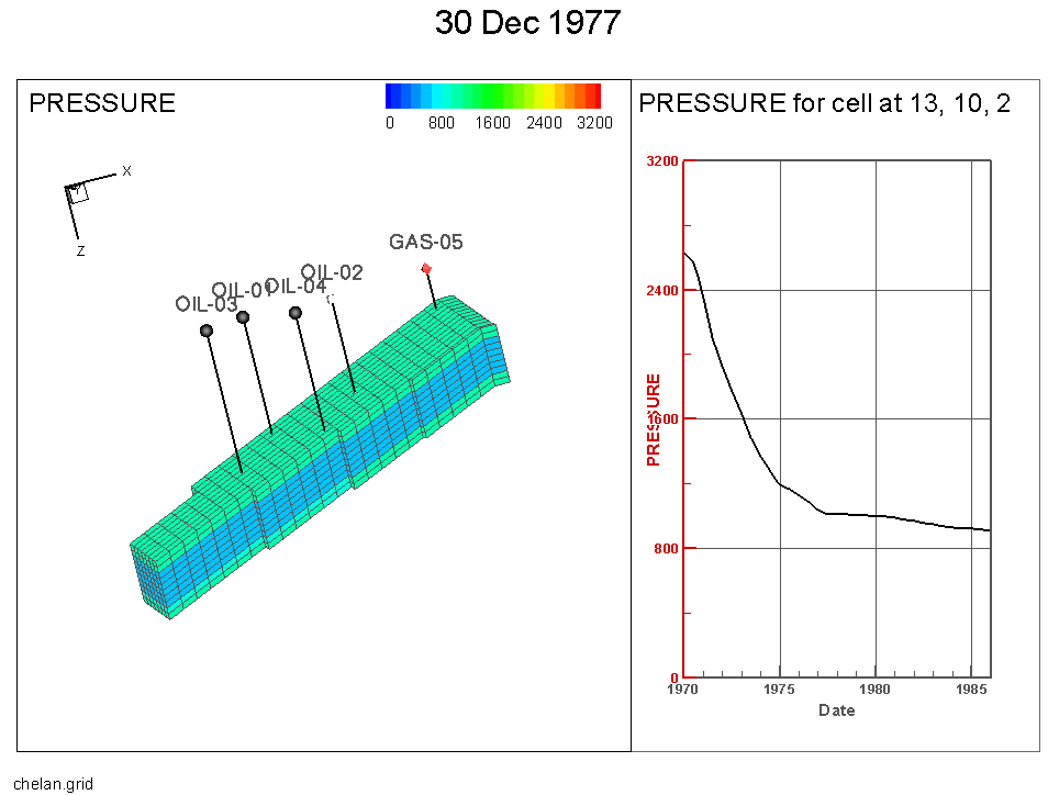
If you change the variable or highlight a different cell, Tecplot RS will update the Time/history frame to reflect the new selections. You can conveniently query values for a selected cell.
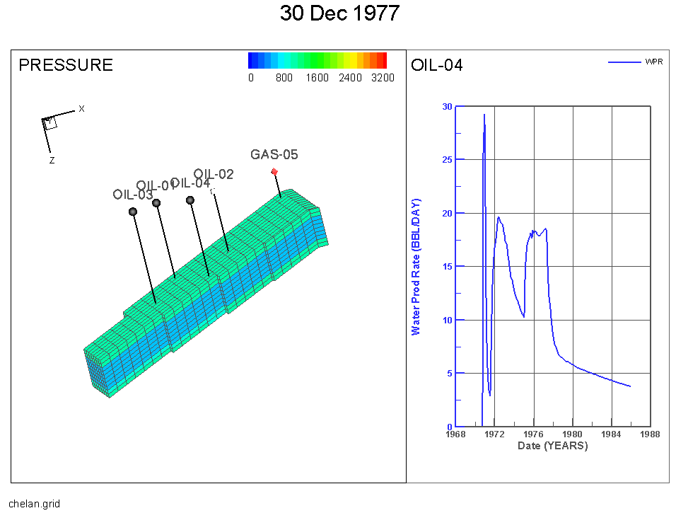
If XY data is loaded into a project with the grid solution, then a user can utilize the Time/history plot to XY data in the quick frame. A user can interactively choose the well data they want to view with the well probe. Clicking the cell that contains the well you are interested in is the most reliable way to choose a specific well.
Depth
The Depth toggle is similar in operation to the Time/History toggle, but the Depth plots show data at various depths. If you have loaded RFT data, you can Control-click a well to see the RFT plot for that well at the time closest to the one selected for the grid display. The sidebar settings for the RFT plot type (accessible by choosing RFT from the Plot Type menu) determine the variables that appear on the Depth plot. If the RFT data has values for multiple times, the Depth plot automatically updates as you change the grid time step.
If you are displaying grid data in 3D, you can also display another type of Depth plot. By clicking a cell (without the Control key) you can get a plot of the cell values versus depth for a column of cells at the IJ location where you clicked. The solution value in this plot is the one shown in the grid in the first frame. If you have chosen delta values, derived (equation values), or KSum/KAvg, the plot also reflects those. Animating or changing the time slider updates the plot at each time step.
| For the column of cells plot, depths are computed from the Z coordinate at the center of each cell. If you have applied Grid Thickening, the Z values will be altered from the original. Z values are not changed when simply exaggerating the vertical scale. |
Well Path
The well path toggle is similar in operation to the Time/History and Depth toggles except it is only available in 3D Grid Plots. The Well Path toggle instead follows the value through the distance of the well path.
Probing along the Well Path also has two options for displaying the data. Either by distance from the first node or vertical depth. These options can be changed by selecting the … button next to Well Path.
2D Plane in 3D View
Use the 2D Plane in 3D View toggle to display a 3D view of your current 2D Grid Plots. The last frame of a multi-frame view always becomes the 2D plane in 3D view, no matter how many plot frames are shown. In single-frame mode, the current 2D view will switch to 3D. It will return to 2D mode when you toggle-off this option.
The toggle provides a 3D view of the 2D plane specified in the Planes region of the sidebar. Use the arrow buttons in the Planes region of the sidebar to scroll through the available planes. This works as an ideal way to view where the currently selected planes in different LGRs sit relative to each other.
Inside Views
When using 3D Grid plots, you can use the Inside View region of the sidebar to view the interior cells of your data set. The Inside View settings allow you to view sets of slices (either in IJK Slice, XYZ Slice or Arbitrary Slice), a group of cells or wells (Well Blank) or a user-defined IJK range (IJK Blank).
You can view the interior of your grid data by the following methods:
-
IJK Slice Use the IJK Slice option to view layers of your data based on selected I, J and K values.
-
XYZ Slice Use the XYZ Slice option to view slices of your data based on selected X, Y and Z values.
-
Arbitrary Slice Use the Arbitrary Slice option to create your own slice based upon points or wells you identify with clicks of the pointer.
-
IJK Blank Use the IJK Blank option to blank regions of your data based upon a range of I, J and K values.
-
Well Blank Use the Well Blank option to display just the cells associated with selected wells.
-
Iso-surface Use the Iso-surface option to create a surface based upon a user-specified variable (such as Pressure)
-
Grids and LGRs View the global grid and/or one or more Local Grid Refinements
-
Faults See faults that have been loaded with your data or defined via constraints
-
NNCs Display Non-Neighbor Connections (for NNCs in 2D Grid plots, see NNCs (2D Grid plots))
| The Show toggle must be activated to view any selections made for an Inside View. |
All Inside Views are controlled by the following toggles, which are next to the drop-down menu.
-
Toggle-on Show to display the selected Inside View.
-
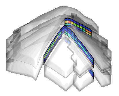
Toggle-on Ghost to display the grid. Use the Grids page of the Plot Options dialog (accessible on the menu) to customize the style of the grid in Ghost mode (click the See-Through Styles radio button).
-
Toggle-on Persistent (not available in all Inside Views) to continue to display the current view when you change to another Inside View type, allowing you to combine views. This will also be turned off when you toggle-off Show.
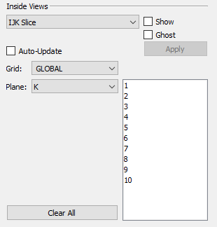
IJK Slice
To incorporate IJK Slices in your plot, use the following procedure:
-
Choose IJK Slice from the Inside View menu in the sidebar.
-
Toggle-on "Show" to incorporate your selections in your plot.
-
Optional: Choose "Auto-Update" to have your plot updated as you make your selections in the sidebar. Otherwise, you will need to click the Apply button for every change. "Auto-Update" is not recommended for very large grids. Instead, use the Apply button to update your plot after making all of your selections.
-
Use the Grid menu to specify whether to apply your plane selections to the Global grid or any Local Grid Refinements (LGRs) included in your data. Child LGRs appear indented relative to their parent LGR in the menu.
-
Use the Plane menu and corresponding list to specify the type of plane and number(s) to display. You can choose multiple plane numbers with the Shift and Ctrl keys.
-
Click the Apply button to apply your settings (if you did not toggle-on Auto-Update).
-
Optional: Toggle-on "Ghost" to see a transparent view of the boundary of the entire grid. Use the Grids page of the Plot Options dialog to choose Ghost options.
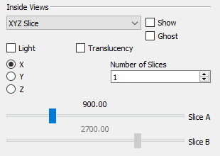
XYZ Slice
In addition to viewing an IJK Slice, Tecplot RS allows you to view XYZ slices inside your data set. Follow these steps to add an XYZ slice or set of XYZ slices.
-
First, choose XYZ Slice from the menu in the Inside View region of the sidebar.
-
Next, toggle-on "Show" to incorporate your selections in your plot.
-
Use the X, Y and Z radio buttons to specify the plane on which to include your slice(s). By default, your XYZ slices will display on an X-plane. Choose the Y radio button to switch to a Y-plane.
-
Use the # of Slices field to change the number of slice to three.
-
Use the sliders to position the your slice(s). The Slice A slider positions the first slice and the Slice B slider move the last slice. Intermediate slices will display at equidistant intervals between Slice A and Slice B.
| If you change to another plane after you have created at least one slice, your slice(s) will display repositioned along the new plane. |
-
Optional: Toggle-on "Ghost" to see a transparent view of the entire grid. Use the Grids page of the Plot Options dialog to choose Ghost options.
-
Optional: When using XYZ slice(s), you can also turn on lighting or translucency for the slice(s), using the Light and Transl toggles available in the Inside Views region of the sidebar. The Light toggle controls light source shading on the slice(s), and the Transl toggle controls surface translucency of the slice(s).
The main Lighting and Translucency controls in the sidebar do not affect these controls - you can have these controls on even if the main controls are turned off.
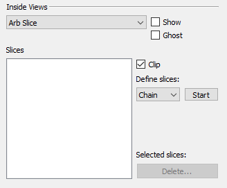
Arbitrary Slice
Use the Arb Slice option in the Inside Views menu to add a slice unrestricted to an X,Y,Z, I, J or K-plane. You can generate arbitrary slices in any orientation parallel to the Z-axis (that is, vertical). As such, you need to specify only two points to create a plane.
To create and view an arbitrary slice, use the following procedure:
-
Choose Arb Slice from the menu at the top of the Inside View region of the sidebar.
Note: If you plan to position your arbitrary slices according to well locations, toggle-on the Wells layer in the sidebar.
-
Optional: Toggle-on Ghost to see a transparent view of the entire grid. Use the Grids page of the Plot Options dialog to choose Ghost options.
-
Define what kind of slices you want to create out of the three options:
-
Chain Creates a slice from two selected points. Each additional selected point will add another slice from the end of the previous one until the Stop button is selected or the right mouse button is clicked.
-
Radial Creates a slice from two selected points. Each additional selected point will add a slice using the first point as the anchor. This operation continues until the Stop button is selected or the right mouse button is clicked.
-
Pairs Creates a slice from two selected points. Each additional selected point will begin the start of another two point pair until the Stop button is selected or the right mouse button is clicked.
-
-
Click the Start button to begin creating your arbitrary slice based on the definition you selected. This will switch the pointer tool into a mode for interactively selecting points.
-
Create your slice(s). Click the top surface of the grid (not the sides) to add a point or points for your slice to pass through. Ctrl+Left-Click for your slice to pass through the nearest well. Right-Click the pointer to end the selection process. You can add a new slice sequence by clicking the Create button again.
The point(s) and well(s) you have selected will appear in the Slices box. Points will be labeled P1 - Pn, and any wells you have selected will be labeled with their name.
-
Use the check boxes next to the points to toggle the selected slice. You can also highlight the slices you want to toggle on or off and select the Turn On or Turn Off button.
-
Slices can also be deleted by being highlighted and then selecting the Delete button.
-
Optional Toggle-on Clip to end the slice at the cell containing the endpoint. Toggle-off Clip to extend the slice to the edge of the grid.
-
Toggle-on Show to incorporate your selections in your plot.
-
Toggle-on "Independent slice frames" to switch to a view which displays each enabled slice in it’s own frame in addition to a reference frame (upper left) which shows all slices. Individual slices in each frame are rotated such that the slice normal vector is pointed directly at the camera. That is, the slice view is "flattened" similar to a 2D view.
When selecting an individual slice frame, the frame is highlighted, and the slice is highlighted in the reference frame view. You can also click on a slice in the reference frame to highlight the individual frame which contains the selected slice.
When "Independent Slice Frames" are active, the plot view cannot be changed to Multi-Frame, Compare, or Dual Porosity view. To change to any of those views, uncheck the "Independent Slice Frame" toggle.
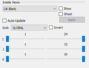
IJK Blank
Use the IJK Blank option in the Inside Views region of the sidebar to choose a given I, J and/or K range of planes to include or exclude from your plot.
To perform IJK Blanking:
-
Choose IJK Blank from the menu at the top of the Inside Views region of the sidebar.
-
Toggle-on "Show". Unless you have already activated Cell Value Blanking or Pick Blanking, you will see your entire plot.
-
Optional: Toggle-on "Ghost" to include a transparent view of the entire grid.
-
Optional: Toggle-on "Auto-Update" to view the results as you make your selections.
-
Use the Grid menu to define the grid for which you are choosing the IJK ranges.
-
Once you have selected the grid to use, you can specify the I, J and K ranges to display using the I, J and K sliders. The sliders on the left-hand side establish the start value to view, and the sliders on the right-hand side establish the end value.
-
Optional: Toggle-on "Invert" to see the I,J, and K values excluded from the ranges specified by the sliders.
-
Click the Apply button to view the results (if you have not selected Auto-Update).
Well Blank
Use the Well Blank option in the Inside Views region of the sidebar to display just the cells that include a well path.
To perform Well Blanking:
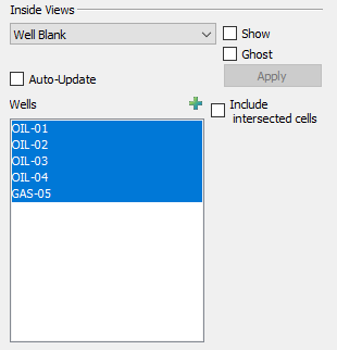
-
Optional: Toggle-on "Wells" in the sidebar to display well nodes and connections.
-
Choose Well Blank from the menu in the Inside Views region of the sidebar. Toggle-on "Show".
-
Optional: Toggle-on "Ghost" to show a transparent view of the grid.
-
Optional: Toggle-on "Auto-Update" to update your plot as you make your selections.
-
You can choose the wells to display (using the Shift or Ctrl keys) in the Wells box.
-
By default, Tecplot RS displays only the cells that contain a completion. To include cells that the well path intersects (defined as straight lines between completions), toggle-on "Include intersected cells".
-
Click the Apply button to view only the selected well(s) (if you have not selected Auto-Update).
Iso-surface
The Iso-surface menu choice in the Inside Views region of the 3D Grid sidebar gives you the opportunity to include iso-surfaces in your plot.
To include iso-surfaces in your plot:
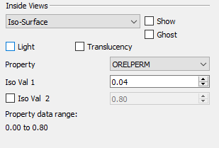
-
Select Iso-Surface from the menu in the Inside Views region of the sidebar and toggle-on "Show".
-
Optional: Toggle-on "Ghost" to show a transparent view of the grid.
-
Use the Variable menu to specify the iso-surface variable.
-
Specify a value of the first iso-surface in the Iso Val 1 box.
-
Toggle-on "Iso Val 2" to include a second iso-surface value. Specify a second iso-surface value in the adjacent box.
-
Optional: When using iso-surfaces, you can also turn on lighting or translucency for the iso-surface(s), using the Light and Transl toggles available in the Inside Views region of the sidebar. The Light toggle controls light source shading on the iso-surface and the Transl toggle controls iso-surface translucency.
The main Lighting and Translucency controls in the sidebar do not affect these controls - you can have these controls on even if the main controls are turned off.
The available data range for the selected variable will display at the bottom of the Inside View region.
Grids and LGRs
The Grids/LGRs menu choice in the Inside Views region of the 3D Grid sidebar lets you display the global grid and/or one or more Local Grid Refinements. To view the grid and/or LGRs in your plot:
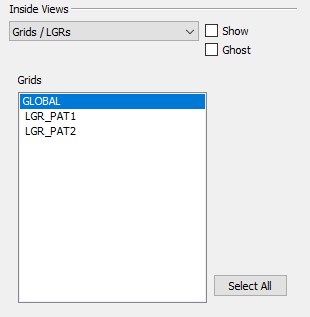
-
Choose "Grids/LGRs" from the menu in the Inside Views region of the sidebar and toggle-on "Show."
-
Optional: Toggle-on "Ghost" to show a transparent view of the grid(s).
-
Choose one or more grids in the Grids list. The GLOBAL entry represents the global grid; the rest are LGRs. Hold down Shift while clicking to select a contiguous range, or Ctrl+Left-Click to toggle individual grids on and off. You may also click Select All to display all grids.
The grids appear or disappear immediately as you turn them on or off.
Faults
Geological faults are represented inside Tecplot RS as cell faces that will be flooded by the variable value from the cell they are attached to. They can be defined in three ways:
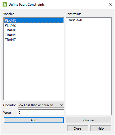
-
They can be loaded along with the grid. With the Sensor and VDB simulators, the fault data is included in the grid data file. With CHEARS and Eclipse, the fault data is a separate ASCII file (with a .faults filename extension) included with the input deck; if it has the same base name as the grid file, it will be loaded automatically. Faults loaded along with the grid will have names or numbers and will be referred to as "named faults."
-
Non-Neighbor Connections (NNCs) included in the grid data can be used to define fault faces. Tecplot RS also has a separate Inside View for NNCs (see NNCs). The difference is that the NNCs view colors the faces based on the value of a specific NNC variable; the Faults view colors them based on the grid variable.
-
Faults may be defined by constraints, which define a variable and condition that identifies the fault cells, for example, TRANX <= 0. (The X in the variable name indicates the face used for the fault.) The Define Fault Constraints dialog (shown here) is launched by clicking the Constraints button in the sidebar when the Faults Inside View is active or by choosing from the menu.
Fault constraints are saved with project files; be sure to save a project file if you wish to save your constraints.
To define a new constraint:
-
Highlight the variable in the list, which displays all static variables whose names begin or end with I, J, K, X, Y, or Z. These may be further decorated with + or - to indicate the upper or lower face.
-
Choose an operator, such as "<=" for less than or equal to.
-
Click Add.
You may click unwanted constraints in the list and click Remove to remove them.
-
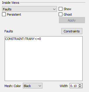
Regardless of how your constraints are defined or loaded, they appear in the Faults list in the Inside Views section of the sidebar. Named constraints, NNCs, and constraints are all listed and may be toggled on and off independently. Click any listed fault to select only that fault; hold Shift while clicking again to select a range of the listed faults. Hold Ctrl while clicking to toggle individual faults on and off. You may also choose the mesh color and the width.
NNCs
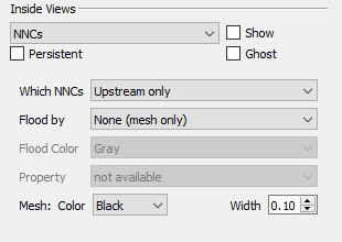
If your grid model includes Non-Neighbor Connections (NNCs), you can view them by choosing NNCs in the drop-down menu of the Inside Views section of the sidebar. (For NNCs in 2D Grid plots, see NNCs (2D Grid plots).) The Inside Views section of the sidebar then shows controls for choosing which NNCs are displayed and specifying how they will appear.
You can choose to display the upstream faces, downstream faces, or both. When both types are displayed, the overlap can cause interference.
The faces may be flooded with no color (displaying only the mesh), a solid color, or contoured based on a selected NNC variable, if your data includes such variables. You may also choose the mesh color and width.
To make the NNC faces visible, Tecplot RS activates see-through grids when NNCs are displayed. Use the Grids page of the Plot Options dialog (accessible on the menu) to customize the See-Through Styles.
When the See-Through Style is set to "Ghost Gray", you can use the Light Effect to alter the appearance of the surface. Choose the "Paneled" Light Effect to get a better idea of cell boundaries (especially when the mesh is turned off), or "Smooth" to create a more rounded look. The "Smooth" option may render slowly on very large models.
Only NNCs within a grid are displayed. NNCs between the global grid and LGRs, or those between two LGRs, are not highlighted, although the boundaries are still visible when translucency is on.
When NNCs are displayed, Tecplot RS displays a legend for the NNC variable. You can move or remove this legend by choosing the Paper Layout plot type and moving or deleting the RS_NNCVAR (the legend title) and/or RS_NNCLEGEND (the legend itself) dynamic text items from the layout.
To adjust the legend, double-click it. The Grid Legend page of the Plot Options dialog appears; click the variable by which the NNCs are colored in the Variables list to modify the NNC legend settings.
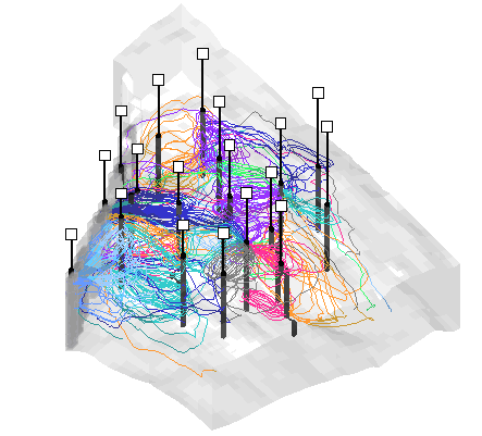
Streamlines
Tecplot RS will display streamline data as an Inside View, providing a look at how fluids move through the reservoir model over time.
Streamline data are stored in separate files. Load streamline data on the File(s) page of the Load Grid Data dialog under the Streamlines heading. Tecplot RS will accept streamlines provided by a simulator that output streamline data in the FrontSim .slnspec format.
| The Active Data Set box on the Grid page of the Manage Data dialog indicates the number of currently available streamline data sets. See Managing Grid Data for details. |
Tecplot RS displays a streamline legend when streamlines are active. To move or remove this legend, switch to the Paper Layout plot type and move or delete RS_STREAMVAR (the legend title) or RS_STREAMLEGEND (the legend itself).
To adjust the legend, switch to the 3D Grid plot type and double-click the legend. The Grid Legend page of the Plot Options dialog appears; click the variable by which the streamlines are colored in the Variables list to modify the streamline legend settings.
Streamline Options
When streamline data are available, the Streamlines view is enabled in the drop-down menu in the Inside Views section of the sidebar. Use the sidebar to choose which streamlines to include and how to display them.
The controls in the Times section of the sidebar control the streamline time step. Typically, streamline times correspond to the grid times, except at the start; you will usually need to move the time slider to at least the second step to see any streamlines. If you do not have streamline data for every grid time step, the streams are drawn for the time step on or before the time selected by the slider. The Times controls may also be used to display or export an animation of the streamlines.
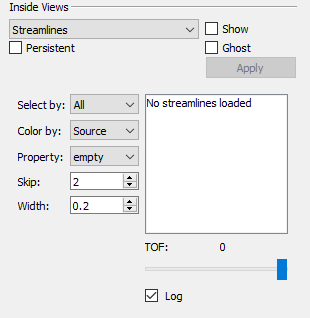
-
Select By By default, Tecplot RS sets the Select By option to "All", so that the plot displays all streamlines. You can change this to limit the displayed streamlines. You can choose the streamlines according to their Source (usually the injector well), Sink (a boundary or producer well), or by individual Pairs.
When you choose a new Select By option, the multi-select list to the right clears and repopulates with the available source, sink, or pair identifiers. You can choose which ones to display by highlighting your choices in the list.
-
Color By Use this option to control how streams are colored. Your choices include:
-
Source Tecplot RS will cycle through eight colors, using a different one for each source or injector well.
-
Sink The termination well or boundary will determine the streamline color.
-
Pair Tecplot RS will plot each well pair in a different color (cycling through the 8 available colors).
-
Variable Multi-colored streams will display according to the variable values assigned to each stream node or segment. If multiple variables are included, you can choose which variable to use from the Variable option menu.
When streamlines are displayed with a variable, Tecplot RS displays a legend for the streamline variable. You can move or remove this legend by choosing the Paper Layout plot type and moving or deleting the RS_STREAMVAR (the legend title) and/or RS_STREAMLEGEND (the legend itself) dynamic text items from the layout.
-
Time of Flight You can color streamlines according to the "Time of Flight" value associated with each node.
-
-
Variable Choose the Variable to use for coloring streamlines.
-
Skip Use the Skip interval to reduce the number of streamlines displayed. This option helps especially when a data set contains so many streams that plotting all of them makes it impossible to see details. You can use a value between 1 and 100 (Tecplot RS uses a default of 5). Tecplot RS will plot at least one streamline between each selected well pair, regardless of the skip factor.
-
Width Use the Width menu to adjust the thickness of your streamlines. Set these values as a percentage of frame size.
-
Time of Flight (TOF) With the slider in the Time of Flight region of the dialog, you can visualize streamlines over time. The slider is scaled over the full range of "Time of Flight" (TOF) values for the chosen streamlines. If you position the slider at an intermediate point, partial streamlines display up to that limit.
-
Log Sometimes a small percentage of the streamlines have a much longer TOF than the rest. This can skew the TOF range so that most of the progress occurs at the lower end of the scale. In these cases, little difference in shading may occur when coloring by "Time of Flight", and you often lack the granularity in the scale slider to control the display.
To remedy this, use the Log Scale option to apply a logarithmic scale over the TOF range. This will impact the color bands used when you color streamlines by "Time of Flight" and will make the scale bar usable for these cases.
-
| If you have input a grid thickening factor other than 1.0 (on the Orient/Thicken page of the Grid Options dialog), streamlines will not display in the correct location relative to the well completions. To view the streamlines correctly, restore the grid thickening factor to 1.0. |
Grid Tools
Tecplot RS includes several advanced features for displaying grid data and extracting information from the model. These can be found on the toolbar.
Measuring Distance on a 3D Grid
 The Measure Distance
tool displays the straight-line distance between two points clicked on a 2D
or 3D grid in the Tecplot RS status bar. Each pair of clicks sets a start
and end point for distance measurement.
The Measure Distance
tool displays the straight-line distance between two points clicked on a 2D
or 3D grid in the Tecplot RS status bar. Each pair of clicks sets a start
and end point for distance measurement.
Probing
The Probe tool allows you to select a location in your plot and view values of one or all variables in that location. You can also view information about the data set while probing. There are two probe tools. One displays the values of all variables at the probed location using a dialog. The other displays the value of only a single variable in the status bar at the bottom of the Tecplot RS window, without a dialog.
 Refer to the following
chapter, Data Probing to learn
more about probing.
Refer to the following
chapter, Data Probing to learn
more about probing.
Streamtraces
Tecplot RS includes the capability to draw streamtraces, which are paths traced by a massless particle placed at an arbitrary location in a steady-state vector field, used to illustrate the nature of the field flow in a particular region of the plot.
 Refer
Streamtraces to learn more about streamtraces.
Refer
Streamtraces to learn more about streamtraces.