Data Analysis
Tecplot RS allows you to analyze your grid data in a variety of ways, including using the menu. The menu acts as the portal to access Histograms and Cross Plots analyses, as well as Performing Integrations.
Statistical Plots
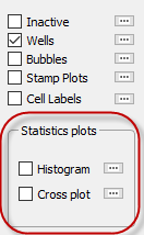
Tecplot RS’s statistical plots, histograms and cross plots, graph the distribution of grid data, enabling you to analyze your data in a visually meaningful way. Accessible by choosing or from the menu, using the options on the sidebar, or using buttons on the toolbar, both of these analysis methods open a smaller frame next to your grid plot that displays the analysis data. When you display a histogram or cross plot, Tecplot RS will resize the plot frame to add the analysis frame. If you have multiple frames shown, Tecplot RS will resize only Frame 1.
Histograms
 When you choose the
Histogram from the menu or by clicking the toolbar
button, the dialog appears. You can show or hide
the histogram plot using the Show checkbox in the dialog or by using
the Quick Stats checkbox in the sidebar. For your convenience, you
may also switch between the histogram and cross plot using the radio
buttons at the top of the dialog.
When you choose the
Histogram from the menu or by clicking the toolbar
button, the dialog appears. You can show or hide
the histogram plot using the Show checkbox in the dialog or by using
the Quick Stats checkbox in the sidebar. For your convenience, you
may also switch between the histogram and cross plot using the radio
buttons at the top of the dialog.
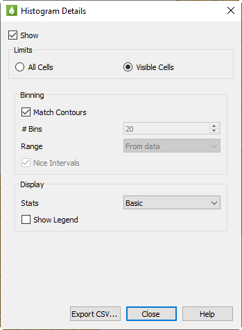
The histogram displays the frequency with which different values of the chosen variable occur. You can change the variable used by choosing a different item in the Variables list in the sidebar. The histogram updates automatically whenever you change a setting.
The Histogram dialog has the following options:
-
Limits You can choose to perform calculations on All Cells in the model, or on only those Visible in the current view.
When Visible Cells is selected for 3D Grid plots, you can control which cells are included in the analysis via the Inside Views option in the sidebar and also the Cell Blanking options (both Pick and Value Blanking).
Grids with LGRs use blanking internally. Cells are blanked in the parent grid where they are replaced by the LGR. Keep this in mind when choosing the All vs. Visible option, since it will affect the cell count.
In 2D Grid plots, the All Cells computations are limited to the single layer being displayed, and Visible Cells can be further limited by Cell Blanking.
-
Binning Histogram data are grouped into bins, with each bin counting the number of cells that fall into a defined range. The Binning options allow you to control the number and range of the bins.
With Match Contours on, the bins match the contour levels used in the current plot and the legend shown in the plot frame. Each bar of the histogram that represents the count of the number of cells in that range will also be colored to match the cell color in the main plot. Since you can customize the contour legend for each variable using Plot Options, your histogram bins and coloring may change when you choose a different variable. In addition, the Plot Options controls will allow you to set up log scales, different color maps, and custom ranges on a variable-by-variable basis. If you make a change in Plot Options for the plot legend, that change will also be reflected in the histogram plot.
| Double-click the legend in the plot frame to be taken directly to Plot Options and the options for the legend for the current variable. |
If you want different bins for your histogram without changing the contours in the main plot, turn off the "Match Contours" checkbox to activate controls that allow you to set bins manually by specifying both the number of bins and the range covered.
-
Display These settings control the display of additional information in the histogram frame.
-
Show Legend Turns on a legend in the histogram frame showing the bin levels and colors. This is similar to the legend shown in the data frame, except the histogram legend is always drawn vertically.
-
Stats Choose None, Basic, or Complete. Basic info includes Min, Max, Mean, and Standard Deviation. Complete info adds Median and Quartiles. These data are displayed as text at the top of the analysis frame.
-
-
Export CSV… button - Click this button to export histogram data as a comma separated data file (CSV).
| The histogram must be displayed in order to export CSV data. |
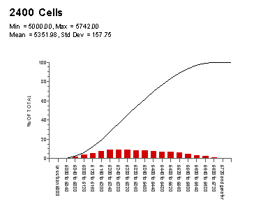
The example histogram shown here uses the Match Contours option for bins and Basic statistics. The Show Legend option is on.
Cross Plots
Like histograms, cross plots also graph the distribution of a data set, giving you another method of visualizing the arrangement of your data. In a cross plot, instead of a number of bins distributing the data, the distributed relationship between two, three, or four variables is shown as a scatter plot.
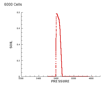
For example, the following plot compares Pressure and Oil Saturation (SOIL) in 6000 cells. With each symbol on the plot representing one of the cells, the display shows that the majority of oil saturation occurs in the cells with a pressure value between 3500 and 3700.
 When you choose the Cross
Plot function from either the Analyze menu or by clicking the toolbar button,
the Quick Stats dialog appears in Cross Plot mode. You can show or hide the
cross plot using the Show checkbox in the dialog or by using the Quick Stats
checkbox in the sidebar. For your convenience, you may also switch between
the histogram and the cross plot using the radio buttons at the top of the
dialog.
When you choose the Cross
Plot function from either the Analyze menu or by clicking the toolbar button,
the Quick Stats dialog appears in Cross Plot mode. You can show or hide the
cross plot using the Show checkbox in the dialog or by using the Quick Stats
checkbox in the sidebar. For your convenience, you may also switch between
the histogram and the cross plot using the radio buttons at the top of the
dialog.
The cross plot automatically updates when you change the settings in the dialog.
The Quick Stats dialog includes the following options when in Cross Plot mode:
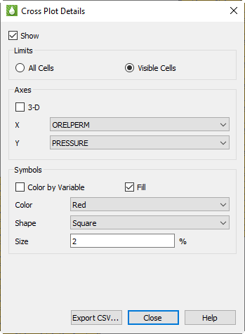
-
Limits You can choose to perform calculations on All Cells in the model, or on only those Visible in the current view.
When Visible Cells is selected for 3D Grid plots, you can control which cells are included in the analysis via the Inside Views option in the sidebar and also the Cell Blanking options (both Pick and Value Blanking).
In 2D Grid plots, the All Cells computations are limited to the single layer being displayed, and Visible Cells can be further limited by Cell Blanking.
-
Axes In the Axes section of the dialog, you can choose which variables to compare on the cross plot. You can choose two variables for a 2D plot, and a third variable when you enable the 3D option.
-
Symbols In the Symbols section, you can customize the symbols displayed on the cross plot by choosing the symbol color, shape, size, and fill option.
You also have the option to Color by Variable, allowing you compare a third or fourth variable on the plot. When this option is checked, you choose a variable name instead of color, and the symbols will be colored just as contours are shown in the grid plot. A separate legend is displayed in the cross plot frame to indicate the color scale.
-
Export CSV… button Click this button to export cross plot data as a comma separated data file (CSV).
| The cross plot must be displayed in order to export CSV data. |
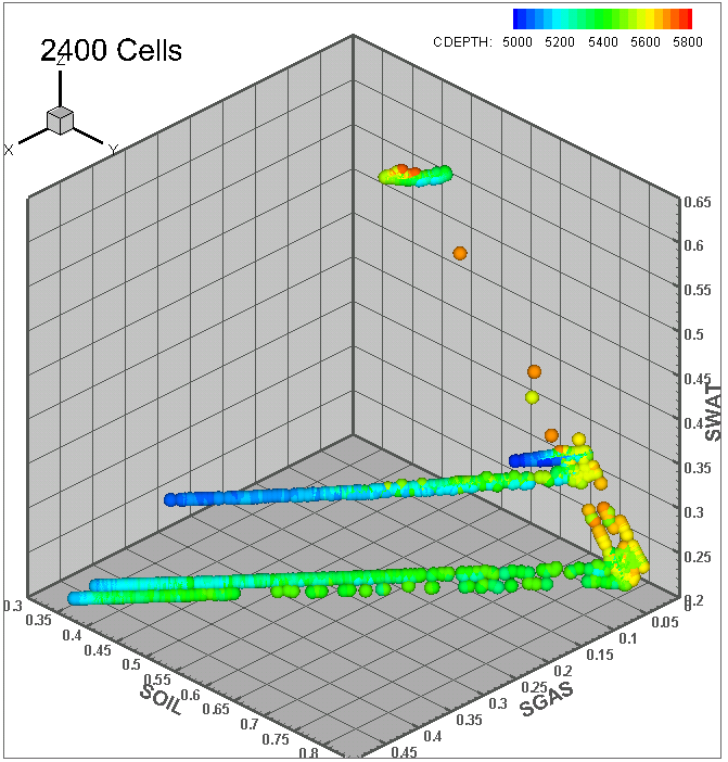
In the example cross plot here, four different variables are compared (one on each of three axes and the fourth by color).
Performing Integrations
To analyze your data using integration, choose "Integration" from the
menu or click the
 button in the
toolbar. Integration cannot be performed when the KSum or KAvg toggle is
active. The Integration dialog appears.
button in the
toolbar. Integration cannot be performed when the KSum or KAvg toggle is
active. The Integration dialog appears.
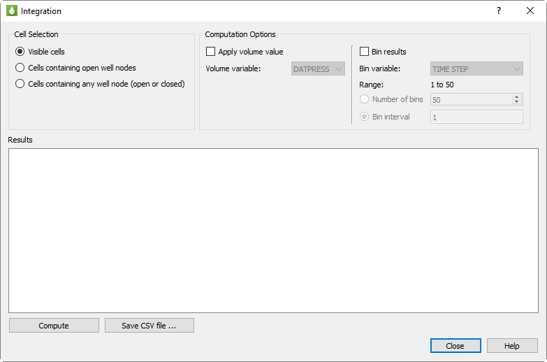
The integration operation sums variable values from the grid cells in the current plot view, determined by the variable value and time step selected on the Tecplot RS sidebar. You may use variables derived from equations and time delta values, as well as variables from your data file. If your plot contains multiple frames, only the values in the first frame are used.
Choosing Cells
Using the Cell Selection radio buttons in the dialog, you can choose to integrate over all visible cells in the current plot or only cells containing completion nodes.
-
Visible cells - All nodes shown in the current plot. If you are using the 2D grid plot type, you can sum values in a single I, J, or K plane. When displaying the grid in 3D, you can sum all of the cells or use the inside views and/or cell blanking to limit the integration to selected areas of the grid.
-
Cells containing well nodes - You may choose either all cells containing any well node (both open and closed), or only those containing open well nodes. Integration is further limited to the wells that are selected for display using the … button next to the Wells toggle on the sidebar.
Binning Results
If you have chosen to integrate over all visible cells, you may bin the results into groups, similar to binning in histograms. (Results are always binned by the individual wells when integrating over only the cells containing wells, so additional binning is not available in this situation.) Using binning, you could, for example, group the results according to the cell depth or FIP number. When you chose to bin the values, the results include separate sums for all the cells that fall into each bin, plus, as usual, the total for all visible cells.
To activate binning, toggle on the "Bin results" checkbox, then choose the binning variable from the list. (Variables calculated from equations are not available for binning.) The dialog displays the range of the selected binning variable and asks you to choose how to determine the bin sizes.
-
Number of bins - Ranges from 2 to 100. This is generally the simplest option, but you may not get the exact number of bins you requested; Tecplot RS automatically adjust the bin ranges to "nice" values depending on your data (you might, for example, get a range of .2 to .4 for a bin instead of .1733 to 3.3487).
-
Bin interval - This choose the interval directly and is not adjusted by Tecplot RS.
If your grid contains transient data, the bin variable list also includes TIME or TIME STEP, either of which is handled differently from other variables. When TIME or TIME STEP is selected, Tecplot RS animates through the time steps in the grid data and integrates at each step. This operation may be slow for large grids with many time steps. You won’t see the plot change during the integration, but when integration is complete, the plot displays the final time step.
Applying Volume Values
You may display additional data with a volume variable applied, expanding the results to include values that reflect the product of the volume variable and the current contour value. Variables commonly used for this function include Pore Volume or Cell Volume.
| If the volume of a cell must be computed from other variables (such as DX DY DZ), use the Grid Equations dialog (accessible from the menu) to solve this value first. Refer to Grid Equations for additional information. |
Integration Results
Click the Compute button to perform the integration and display the values computed from the grid cells in the table at the bottom of the dialog. If you change any setting in the Integration dialog or any of the values or settings that have an influence on integration (for example, blanking criteria, variable, or time step), you must click Compute again to display updated results.
The results include:
| # Cells | How many cells were included in the computation |
|---|---|
Sum |
The sum of the values (of the contour variable displayed in the frame) for all cells included (as determined by the Cell Selection and Binning options) |
Min/Max |
The smallest and largest value for the cells in a bin |
Avg |
Sum divided by the number of cells |
Product Sum |
Sum of all product values (that is, the contour variable value multiplied by the Volume variable value) in each cell |
Volume Sum |
Sum of all Volume variable values |
Product Avg |
Product Sum (see above) divided by the number of cells |
Weighted Avg |
Product Sum divided by Volume Sum |
In addition to displaying the results in the dialog, you may click to Save CSV File button to export the results to a comma-separated value file suitable for import to Microsoft Excel and other software.