Exploring Your Results
Tecplot Chorus allows you to explore the results in your project in the following ways.
-
In a spreadsheet-like table, providing a way to see all values for all cases
-
In a matrix of images, letting you filter results and identify cases of interest at a glance
-
In a line, symbol, or scatter plot, so you can visualize correlations and overall trends
When you open or create a project (see Projects), the Tecplot Chorus workspace appears with a Table View of the project’s data (see Table Views).
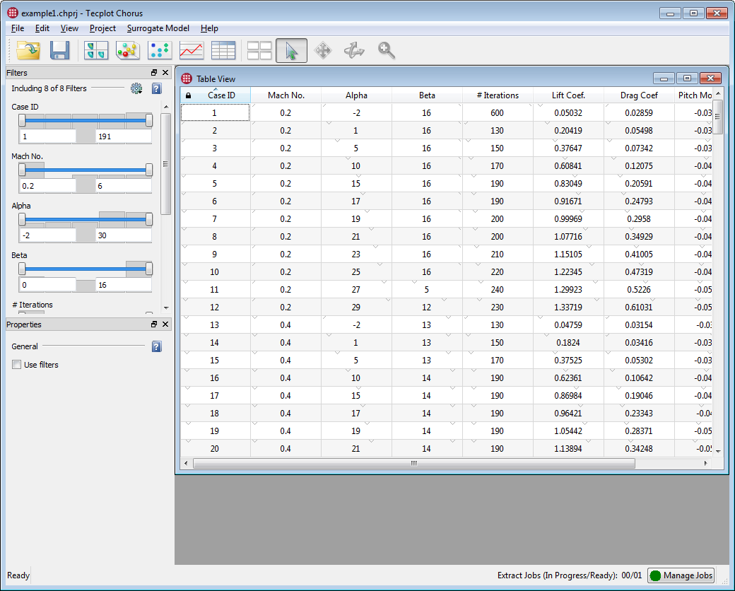
You can open additional views using commands on the menu or by clicking a button on the Tecplot Chorus toolbar.

| You can save a session file after opening the views you find useful. Next time you want to work with the project, open that session file to load the project and restore the views. See the and commands on the menu. |
Each view you open appears in its own window in the Tecplot Chorus workspace. You can open any number of views, including multiple views of a single type (for example, multiple 2D scatter plots showing different combinations of variables, or two tables showing different sections of your results).
|
You can resize, minimize, and maximize windows inside the Tecplot Chorus workspace. The You can also drag view windows outside the Tecplot Chorus workspace and move them anywhere on any display. Such windows always appear in front of the main Tecplot Chorus window and thus in front of any windows still inside its workspace. Click the close button in such a window to move it back into the workspace. |
When a view window is active, the Filters and Properties panels become active.
-
The Filters panel affects all view windows and will be described in the next section.
-
The Properties panel, on the other hand, has different options for each type of view and will be described separately for each view.
Context Menus in Views
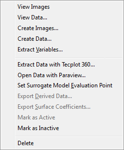
Right-clicking any case in any plot or view displays a context menu for quick access to frequently-needed tools. These vary slightly by type of view, but may include:
-
Viewing auxiliary files such as images or data associated with the case (see Viewing Images and Viewing Data)
-
Generating new images or layout packages for the case (see Creating Images and Creating Data Files)
-
Extracting a variable from a case’s data file (see Extracting Variables from Data Files)
-
Saving an image of the plot
-
Exporting data generated by a surrogate model (see Surrogate Models)
-
Setting the case’s variable values as the evaluation point for a surrogate model (see Setting the Evaluation Point from a Selected Case)
-
Making the case active or inactive
-
Deleting the case from the project
-
Custom actions created by you or other Tecplot Chorus users to operate on a case’s data (see Custom Actions)
Filters
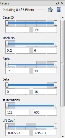
The Filters panel lets you determine which cases are shown in plots or in a matrix by excluding or including cases in which specified variables have particular values or fall within a certain range. Filters apply globally to all Tecplot Chorus views (there are not separate filters for each window). Changes are applied immediately to all open views.
If the Filters sidebar is not visible, open it by choosing . This sidebar may be docked to any edge of the Tecplot Chorus window, combined with the Properties sidebar, or dragged out of the Tecplot Chorus window entirely and positioned on any display.
Each active variable in the project is displayed in the Filters panel along with a control that allows you to restrict the cases included in the plot or matrix based on the variable’s value. (See Managing Filters to learn how to choose which variables appear in the Filters sidebar.) The sidebar scrolls vertically if not all the filters fit in the sidebar at once.
| By default, the Filters sidebar does not have an effect on Table views. You can enable table filtering in the Properties sidebar when a window containing a table is active. |
Tecplot Chorus initially displays filters for all the variables in your project. You
can change which variables appear in the Filters panel by clicking the
 gear icon in the Filters panel and choosing Select
Filters to Include (see Managing Filters).
Constraint Visualization
The filter settings are made visible in the List view, the Selected Cases view, and optionally in the 2D Scatter plot. This feature is called constraint visualization. For more details, see:
Filter Types
Tecplot Chorus provides four different types of filters. Initially, parameters having a small number of discrete values use a Checkbox filter, while other variables default to a Range filter. You may, however, change the filter type for any parameter by right-clicking the filter and choosing the desired filter type from the pop-up menu.
- Range

-
Displays only cases where the variable’s value falls within a specified range. Provides a slider control with two handles to specify the minimum and maximum. You may also enter values using the keyboard. A histogram behind the slider gives you a rough idea of the distribution of values in the project.
- Single Value

-
Displays only cases where the variable’s value is exactly the specified value. A handle is provided to choose the value, or you may enter the value using the keyboard. Tick marks under the slider indicate values of the variable that have associated cases.
- Checkbox

-
Displays a list of the available values for the variable and lets you choose any combination of values by clicking the checkbox next to each. Only cases where the variable has one of the selected values are included in the plot. The number of cases having each value are displayed in parentheses next to the value. Only available for variables having 10 or fewer unique values.
- Listbox

-
Displays a list of the available values for the variable in a scrolling list. You can choose any combination of values for the variable. Only cases where the variable has one of the selected values are included in the plot. The number of cases having each value are displayed in parentheses next to the value.
The Listbox is functionally similar to the Checkbox filter type, but is better suited for variables having a larger number of discrete values. Also, in a Listbox, it is easier to select one value at a time, or to select ranges of values, than in a Checkbox.
-
To select a single value, click that value. All other values are automatically de-selected.
-
To toggle individual values off and on without affecting other values, click each value while holding the Control key.
-
To select a contiguous range of values, click the first value in the range, then click the last value in the range while holding the Shift key. Alternatively, click and drag the mouse through the range.
-
You may select multiple contiguous ranges of values. Select the first range as above, then select the second and subsequent ranges by holding Control while clicking the first value in the range, and Control + Shift while clicking the last value in the range. Alternatively, you can hold the Control key while clicking and dragging the mouse to select additional ranges.
| Filter on Case Status to display only cases designated as active or inactive. |
Your filter settings are saved with sessions (see Sessions).
Null Value Filtering
Null values arise from invalid or missing data for a variable. Internally, Tecplot Chorus represents these as the special floating-point value (meaning "Not a Number"), and they will appear as such in the Table view of your project.
You may remove cases having null values from consideration by Tecplot Chorus using filters.
-
For Range filters, a checkbox, , allows you to choose to view cases with null values or filter them out. This checkbox appears only for variables in the project having null values.
-
For Checkbox and Listbox filters, "null" appears as a value, along with the other values for a given variable in the project, if there are any cases having a null value for the variable being filtered. You can turn off the checkbox or deselect the value if you don’t want to see such cases.
Managing Filters
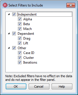
You can change which variables appear in the Filters panel by clicking the
 gear icon in the Filters panel and choosing
. The Select Filters to Include dialog appears.
In the dialog, you can hide filters for any variable, or for whole categories of variables, by clicking the checkbox next to the variable or category. Turning a category on or off enables or disables all variables in that category.
Filters that are disabled here are not displayed in the Filters sidebar and have no effect on the displayed cases.
Matrix Views
To open a new matrix view, choose , or click
 in the toolbar.
Tecplot Chorus’s Matrix view displays thumbnails of images associated with the cases in your project in a grid, allowing you to quickly sanity-check your solutions and dive deeper into any case that looks interesting. These images may be produced by a postprocessor or by Tecplot Chorus itself (see Creating Images). Tecplot Chorus links externally-generated images to their case when the project is created (or when data is appended to it).
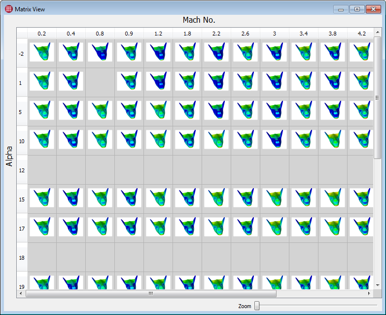
Rows in the matrix represent values of one parameter, while columns represent values of another. The grid may optionally be broken into pages based on values of a third parameter. Each discrete value of a selected parameter found in the project is given its own row, column, or page, respectively.
If your project is very sparse, or if not all your cases have images associated with them, your matrix may appear mostly blank, and you may have some trouble finding the cases you want. You can use filters (see Filters) and the other views to help you home in on cases of interest.
Conversely, a given cell in the matrix could represent more than one case based on values of one or more of the project’s variables that you have not assigned to rows, columns, or pages. For example, if you have variables a, b, c, and d, and have assigned a and b to rows and columns, then a cell at a=1, b=2 represents cases that have those values of a and b but any values of c and/or d, and this could be any number of cases, any of which may have at least one image associated with them.
When more than one case is matched by matrix cell, a
 badge appears in the cell
with the thumbnail. The actual thumbnail that appears in the cell is a representative
image chosen by Tecplot Chorus from one of the cases. You can turn on labels to see
exactly which case’s thumbnail is being shown (see
Matrix View Properties), and you can choose the values selected
for any variables not employed in the matrix by using a single-value filter (see
Filters).
Hovering the mouse pointer over a cell reveals the number of additional cases represented by the cell (for cells that match more than one case), along with information about the thumbnail, such as its path and its case’s Case ID.
The Zoom slider at the bottom right of the window adjusts the size of the thumbnails shown in the matrix.
Matrix View Properties
If the Properties panel is not visible, open it by choosing . This panel may be docked to any edge of the Tecplot Chorus window, combined with the Filters panel, or dragged out of the Tecplot Chorus window entirely and positioned as desired on any display.
You can set the following matrix view properties:
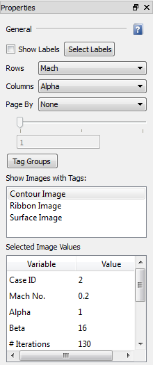
- Show Labels
-
Shows variable values in cells containing an image. Click to choose which variables to display.
- Rows
-
Chooses the variable that will be used to sort your cases into rows.
You may also choose "Tag." In this case, each row of the matrix will correspond to one of the tags selected in the Show Images with Tags list, which contains a list of all image tags in the project.
- Columns
-
Chooses the variable that will be used to sort your cases into columns.
You may also choose "Tag." In this case, each column of the matrix will correspond to one of the tags selected in the Show Images with Tags list, which contains a list of all image tags in the project.
- Page By
-
Chooses a third variable to be used to sort the matrix into pages.
If Page By is set to None, the paging feature is disabled and only a single page is shown. If it is set to a variable, the slider below the Page By menu can be used to select a page for each discrete value of that variable. You may also enter a value directly into the numeric field using the keyboard.
- Tag Groups
-
Opens the Tag Groups dialog to allow you to create and modify tag groups. See Tag Groups.
- Show Images with Tags
-
Chooses the image tags or tag groups to be viewed in the matrix. Multiple tags or groups may be selected by dragging the mouse, or by clicking using the Control or Shift keys to toggle individual items and make contiguous selections.
If either of the Rows or Columns menus is set to "Tag," this setting affects how many rows or columns will be displayed; tags that are not enabled here will not have a corresponding row or column.
Otherwise, this setting determines which tags are chosen for display in cells in the matrix. As described earlier, any matrix cell may represent more than one case. When multiple image tags are selected, a cell may also represent multiple images for a single or multiple cases. A cell that holds multiple images displays the
 badge in the corner.
 - Selected Image Values
-
Displays the values of all variables from the cases associated with the selected images in a scrollable table.
If multiple cases are selected, the text "(Multiple values)" appears next to any variable that does not have the same value in all selected cases.
Tags are defined when creating a project or adding data to a project. See Tagging Image and Data Files.
Selecting Cases in a Matrix View
You can select cases using thetool, then perform operations on the selected cases.
-
Click a cell to select the cases in it. Any other selected cases are automatically de-selected.
-
Click and drag the mouse to select the cases in any rectangular subsection of the matrix. Any other selected cells are automatically de-selected.
-
Hold Shift while clicking to select a rectangular range of cells between an initial click and your Shift-click.
-
Hold Control while clicking to toggle the selection status of the clicked cell without de-selecting any other cells that are selected.
Control has a similar effect when dragging (to select an additional rectangular subsection of the matrix).
-
Click a row or column header to select all cases in that row or column.
You may hold Control while clicking to select additional noncontiguous columns, hold Shift while clicking to select a range of rows or columns, or drag across the headers.
-
Press Control-A to select all cases.
| Cases selected in a any view or plot are selected in all open views and plots. |
After selecting cases in the table, click the right mouse button on the selection to view or create images or data for a case. See Analyzing Individual Cases for further details on these operations.
| The right-click menu also lets you designate the selected cases as active or inactive, which sets the internal variable Case Status accordingly. Filter on Case Status to display only active or inactive cases. |
Tag Groups
Tag groups make it easy to organize and work with various combinations of related images. For example, suppose your project contains surface, streamtrace, and volume plots, each from three different angles, for every case you’ve run. You might want to create a set of tag groups that selects all styles of plots from a single angle, and another set of tag groups that selects all angles of a single plot. Any number of tag groups may be created, and each group can contain any of the image tags in the project.
You’ll see your tag groups displayed in the Show Images with Tags list in the Properties sidebar panel of matrix views and of image viewer windows. (Groups are prefaced with "Group:" in this list.) Turning on or off a group activates or deactivates all the tags in the group for display in the matrix or image viewer, just as if you had turned them all on or off individually. The order of the tags in the group determines the order the tags are displayed in image or matrix views.
To edit tag groups, you use the Tag Groups dialog, accessible via the button in the matrix view or image viewer Properties panel.
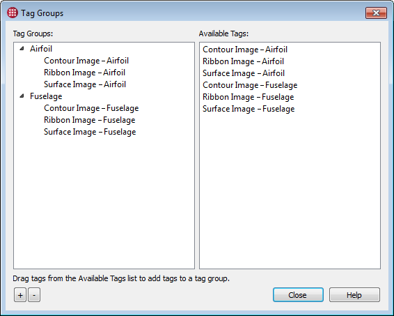
In the Tag Groups dialog, you can:
-
Create a new tag group by clicking the button.
-
Delete a tag group by selecting it in the Tag Groups list and clicking the button. This does not delete any tags that the tag group contains.
-
Delete a tag from a tag group by selecting it and clicking the button.
-
Add tags to a tag group by dragging tags from the Available Tags list to the tag group name in the Tag Groups list. Note that this does not remove the tags from the Available Tags list; they remain available for adding to other tag groups.
-
Change the order of tags in a tag group by dragging them up or down with in the tag group.
-
Hide or show the tags in a group in the Tag Groups list by clicking the triangle to the left of the tag group’s name.
The Tag Groups dialog may be left open while you work and positioned out of the way or on a second display, so it is always available to manage your tags. Changes you make to the order of tags in a tag group are reflected instantly in any open matrix views or image viewer windows that are displaying images by tag.
| Tag groups are stored in session files, so you should save a session by choosing from the menu if you want to use the same tag groups in a future Tecplot Chorus session. |
Scatter Plots
Tecplot Chorus provides both 2D and 3D scatter plots. To open a new scatter plot,
choose or from the
menu, or click  or
or
 in the toolbar.
Scatter plots are useful to visualize trends and correlations between two or more variables. On a scatter plot, each case appears as a single scatter symbol. Its position represents two (or three, in the case of a 3D plot) variables, and its color—and in a 3D plot, its size—can represent an additional variable or two.
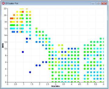
2D scatter plots are useful for comparing two main variables. For example, it can reveal a relationship between an independent and dependent variable, or correlations between two dependent variables. 2D scatter plots can also be used for visualization of constraints.
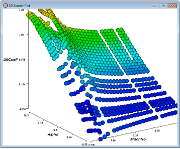
3D scatter plots are typically used in situations where two variables (which appear on the X and Y axes) affect, or are correlated with, the result of a third (which appears on the Z axis). The 3D scatter plot can be rotated interactively to reveal details that may not be apparent from all angles (see Zooming, Translating, and Rotating Scatter Plots).
Scatter plots may be saved as a PNG (Portable Network Graphics) file by right-clicking the plot and choosing Save Plot as Image from the context menu, or by clicking the button in the plot’s sidebar. The saved image is the same size as the version of the plot displayed on the screen.
Scatter Plot Properties
If the Properties panel is not visible, open it by choosing . This sidebar may be docked to any edge of the Tecplot Chorus window, combined with the Filters sidebar, or dragged out of the Tecplot Chorus window entirely and positioned as desired on any display.
2D Scatter Plot Properties
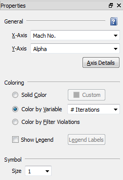
- General
-
Sets general options for the plot.
- X-Axis, Y-Axis
-
Choose the variables to be used for the X and Y axes. The values of the selected variables will be used to position the scatter symbols on the plot.
- Axis Details
-
Click to open the Axis Details dialog and specify range and grid spacing for each axis. See Setting Axis Details.
- Coloring
-
Choose the color for the scatter symbols. You may choose a single, solid color, to have the scatter symbol color chosen automatically based on the value of a variable, or to have filter violations displayed in a special color.
- Solid Color
-
All cases are displayed in the single color you choose using the drop-down color menu. Click the color tile to create your own color using a color mixer.
- Color By Variable
-
Cases are colored based on the value of a variable. You may also optionally display a legend indicating the colors that correspond to the values of the selected variable.
- Color By Filter Violations
-
All cases are displayed regardless of filter settings. However, the symbols representing the cases are color-coded to indicate which filters apply to them (see Constraint Visualization with 2D Scatter Plots).
- Show Legend
-
If coloring by variable, activate the checkbox to display a color legend in the plot. Click to set the range and number of steps for the labels in the legend using the Color Legend dialog (see Color Legend Dialog).
- Symbol
-
- Size
-
Choose the size for the scatter symbols.
Constraint Visualization with 2D Scatter Plots
When you set a 2D scatter plot to be colored by filter violations, you enable the visualization of constraints in your plot. Filters on dependent and independent variables no longer hide cases, but rather affect the color of the symbols representing the individual cases. (Filters on other variables continue to hide cases, as usual.) The legend, shown at the upper right of the plot below, can be toggled on or off in the Coloring section of the Properties panel. A shaded area further highlights the cases that fall outside the filter values set for the axis variables.
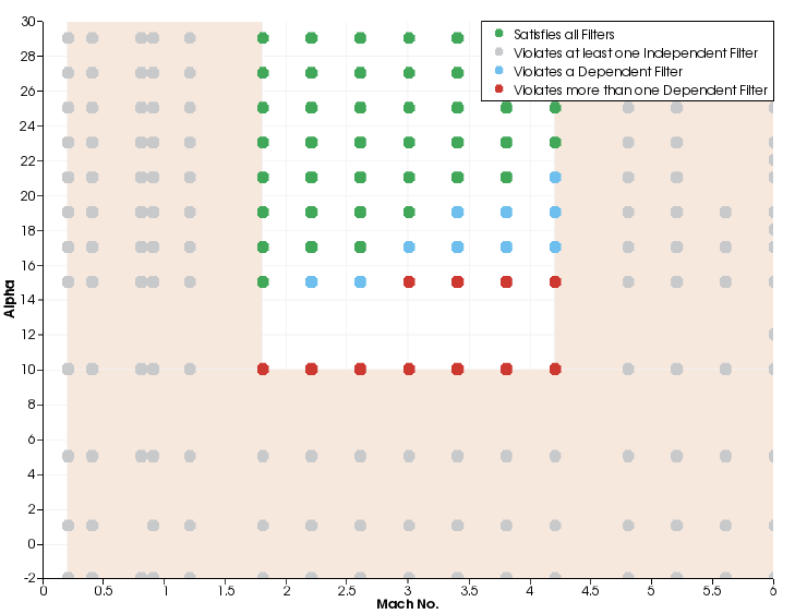
In this example, the filters have been set to exclude cases by Mach No. and Alpha (the shaded area, with the individual cases shown in gray because they also violate a filter on an independent variable) and also to exclude certain other cases by their lift and drag coefficients. These cases are displayed in blue (for cases that only violate one of the lift and drag constraints) or red (for cases that violate both the lift and drag constraints).
If an additional filter were added on another independent variable (such as Beta), additional cases could change to gray outside the shaded area, since their Mach No. and Alpha variables might still fall inside the white (unconstrained) area.
3D Scatter Plot Properties
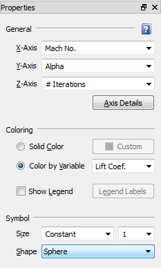
The Properties panel for 3D scatter plots is divided into four sections: General, Coloring, Symbol, and Surrogate Model. We will not consider the Surrogate Model section here. For more information on surrogate models, see Surrogate Models.
- General
-
Sets general options for the plot.
- X-Axis, Y-Axis, Z-Axis
-
Choose the variables to be used for the X, Y, and Z axes. The value of the selected variables will be used to position the scatter symbols.
- Axis Details
-
Click to open the Axis Details dialog and specify range and grid spacing for each axis. See Setting Axis Details.
- Coloring
-
Choose the color for the scatter symbols. You may choose a single, solid color, or to have the scatter symbol color chosen automatically based on the value of a variable.
- Solid Color
-
All cases are displayed in the single color you choose using the drop-down color menu. Click the color tile to create your own color using a color mixer.
- Color By Variable
-
Cases are colored based on the value of a variable. You may also optionally display a legend indicating the colors that correspond to the values of the selected variable.
- Show Legend
-
If coloring by variable, activate the checkbox to display a color legend in the plot. Click to set the range and number of steps for the labels in the legend using the Color Legend dialog (see Color Legend Dialog).
- Symbol
-
Sets the symbol size and shape.
- Size
-
Choose the size for the scatter symbols. You may choose a constant size, or to have the size determined by the value of a variable.
- Shape
-
Choose a sphere or a cube.
Color Legend Dialog
The Color Legend dialog allows you to specify the approximate number of labels in the legend and the range represented by the legend.
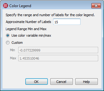
- Approximate Number of Labels
-
The approximate number of labels in the legend. The number of labels you see in your legend may not be exactly the number you enter here; more labels may be used to make the ranges "nicer."
- Legend Range
-
Using the radio buttons, you may choose to use the minimum and maximum values of the variable selected for "Color By," or manually enter a custom range.
Zooming, Translating, and Rotating Scatter Plots
The following tools, which you will find on the Tecplot Chorus toolbar, can be used to zoom, translate (move), and rotate your scatter plot.
 Moves the plot. With a 2D plot, the axes stay
in the same location and the values represented on the axes change, showing you a
different part of your data. With a 3D plot, the entire plot, axes and all, moves
within the window.
 Zooms the plot. When this tool is active in a 3D
scatter plot, moving the mouse up and down while holding down the mouse button zooms
the plot in and out, respectively.
In a 2D scatter plot, use the mouse to draw a rectangle around a group of points to zoom in on them.
| You can also zoom the plot at any time (without switching to the Zoom tool) by moving the wheel on your mouse, if it has one. |
 Rotates the plot. Hold down the mouse button and
move the mouse to rotate.
| Only 3D scatter plots may be rotated. |
To reset the view back to the default, undoing all zooming and translation (but not rotation), choose .
Selecting Cases in a Scatter Plot
Each symbol in a scatter plot represents one case. You can select cases using the
 tool, then perform operations on the selected
cases.
-
Click a symbol to select a single case. All other cases are de-selected.
-
To toggle the status of individual cases without affecting other cases, click single symbols while holding the Control key.
-
To select a group of cases, drag a rectangle around them using the mouse. All cases that fall inside the rectangle are selected; all others are de-selected.
-
To select multiple groups of cases, hold the Control key while dragging a rectangle around the second and subsequent groups of cases.
| Cases selected in any plot or view are selected in all open views and plots. |
After selecting cases in the plot, click the right mouse button on the selection to view or create images or data for a case. See Analyzing Individual Cases, for further details on these operations.
| The right-click menu also lets you designate the selected cases as active or inactive, which sets the internal variable Case Status accordingly. Filter on Case Status to display only active or inactive cases. |
Line and Symbol Plots
To open a new line or symbol plot, choose , or click
 in the toolbar.
Line plots are often used to visualize how an input (independent variable) affects an output (dependent variable). They are especially useful for comparing magnitude of change between one data point and the next. Adjacent points are always connected by straight lines, making any deviations from an expected progression immediately obvious.
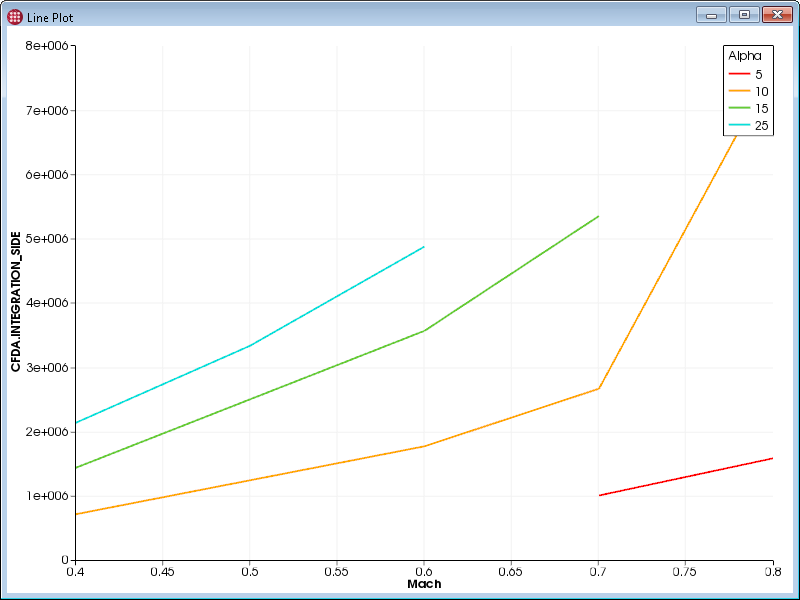
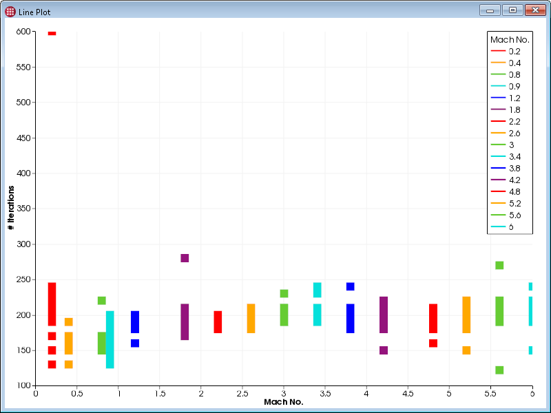
The line plot can display symbols at each data point in addition to, or instead of, lines between them. Symbols-only mode is often used when the values being displayed are discrete rather than continuous, such as in this plot showing the number of iterations a solution requires to converge for each Mach value simulated.
Line and symbol plots may be saved as a PNG (Portable Network Graphics) file by right-clicking the plot and choosing from the context menu, or by clicking the button in the plot’s sidebar. The saved image is the same size as the on-screen version of the plot.
Zooming and Translating Line and Symbol Plots
The following tools, which you will find on the Tecplot Chorus toolbar, can be used to translate (move) and rotate your line or symbol plot. To reset the view back to the default, undoing all zooming and translation, choose .
 Translate tool; moves the plot. The axes stay
in the same location and the values represented on the axes change, showing you a
different portion of your data.
 Draw a rectangle to zoom in on that portion of the
plot.
| You can also zoom the plot at any time (without switching to the Zoom tool) by moving the wheel on your mouse, if it has one. |
Line and Symbol Plot Properties
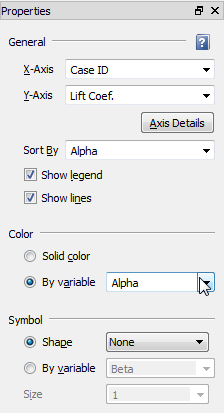
If the Properties panel is not visible, open it by choosing . This panel may be docked to any edge of the Tecplot Chorus window, combined with the Filters sidebar, or dragged out of the Tecplot Chorus window entirely and positioned as desired on any display.
The Properties panel for a line or symbol plot is divided into four sections: General, Coloring, Symbol, and Surrogate Model. We will not consider the Surrogate Model section here. For more information on surrogate models, see Surrogate Models.
Using the Color and Symbol settings, it is possible to group cases by the discrete values of up to two variables and represent them by either unique colors or symbols.
- General
-
Sets general options for the plot.
- X-Axis, Y-Axis
-
Choose the variables to be used for the X and Y axes.
- Axis Details
-
Click to open the Axis Details dialog and specify range and grid spacing for each axis. See Setting Axis Details.
- Sort By
-
The cases are drawn in order from the lowest to highest value of the variable selected here. Usually an independent variable (often the X-axis variable in the plot).
- Show Legend
-
A checkbox that shows or hides a legend of line colors corresponding to values of the current Sort By variable.
- Show Lines
-
Choose to include lines in the plot. (The visibility of symbols is controlled using the Shape drop-down menu in the Symbol section.)
- Color
-
Sets the color grouping.
- Solid Color
-
The lines or symbols are all given a single color.
- By Variable
-
Groups discrete values of the chosen variable together and draws these cases separately using a different color for each value. The colors assigned to each value appear in the legend, if shown.
- Symbol
-
Sets the symbol grouping, size, and shape.
- Shape
-
Selects a static symbol shape and does not group on a variable. Choose the desired symbol shape. Set to None to hide symbols entirely.
- By Variable
-
Groups discrete values of the chosen variable together and draws these cases separately using a different symbol shape for each value. The symbol shapes assigned to each value appear in the legend, if shown.
- Size
-
Choose the desired static symbol size.
Selecting Cases in a Line or Symbol Plot
You can select cases using the  tool, then
perform operations on the selected cases. This is simplest to do if symbols are
displayed, as the actual data points are not always obvious when only lines are
displayed. (The Lines & Symbols plot mode is often useful here.)
-
Click near a case to select the case. Any other selected cases are de-selected.
-
To select a group of cases, draw a rectangle around them using the mouse. All cases that fall inside the rectangle are selected; all others are de-selected. It may be useful to have a table view open to confirm that you have selected the desired cases.
-
To select multiple groups of cases, hold the Control key while drawing a rectangle around the second and subsequent groups of cases.
| Cases selected in any view or plot are selected in all open views and plots. |
After selecting cases in the plot, click the right mouse button on the selection to view or create images or data for a case. See Analyzing Individual Cases for further details on these operations.
| The right-click menu also lets you designate the selected cases as active or inactive, which sets the internal variable Case Status accordingly. Filter on Case Status to display only active or inactive cases. |
Setting Axis Details
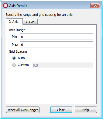
By default, Tecplot Chorus uses the minimum and maximum values of the variable assigned to an axis as that axis’s range, and automatically determines the spacing of the grid. These settings can be adjusted for each plot by clicking the Axis Details button in the plot’s Properties sidebar.
The dialog has a page for each axis in the plot. Shown here is the Axis Details dialog for a 2D Scatter Plot, which has two axes. The 3D Scatter Plot has three tabs, since it has three axes. The contents of each tab are the same.
- Axis Range
-
Enter custom min/max values for the axis. The defaults are the minimum and maximum values of the axis variable.
- Grid Spacing
-
Allow Tecplot Chorus to automatically determine the grid spacing, or manually enter a custom spacing value. Not available for 3D Scatter Plots.
- Reset All Axis Ranges
-
Resets the range settings for all axes to the default values (the minimum and maximum values of the variable assigned to the axis).
Table Views
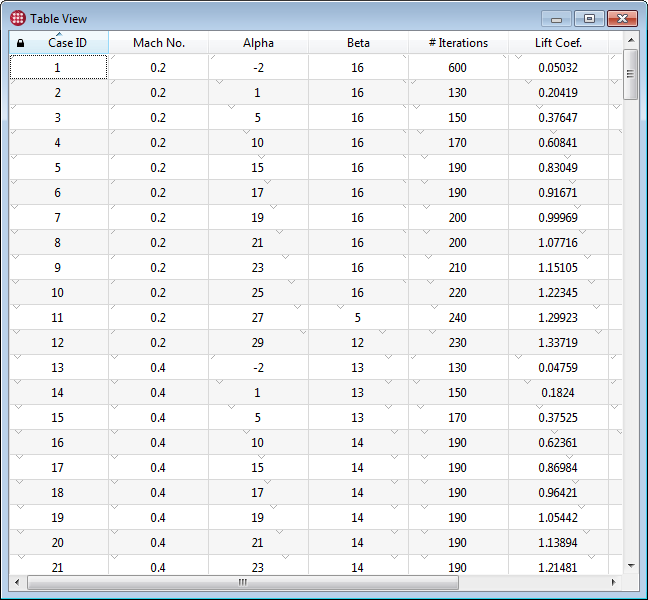
A Table view is a simple spreadsheet-like listing of the values of each variable for every case in the project.
To open a new Table view, choose or click the
 button in the toolbar. Rows represent cases and
columns represent variables. You can scroll the table horizontally or vertically if
necessary to see all the data in the project, and sort by the value of any variable by
clicking a column header. (Clicking the same column header again reverses the sort
order.) Drag the column headers to rearrage the display order of the variables; this is
saved in the session file.
Constraint Visualization with Table Views
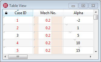
Cases listed in the Table view incorporate indicators that show how the displayed cases relate to the filters. Some of these indicators are most useful with Range filters (see Filters for a tour of the types of filters). The indicators are:
-
Shading along the left and/or right edges of the cell indicates the proportion of the minimum/maximum values of the filter to the variable’s range.
In the example here, the Mach Number filter (a Range filter) is set to exclude about the lowest 20% and the highest 40% of values. Therefore, about the left 20% and the right 40% of the Mach Number column is shaded.
-
A small, gray downward-pointing tick mark at the top of each cell indicates the position of the cell’s value in the variable’s range. The lowest value has this tick mark placed at the left of the cell, and the highest has it at the right. Other values have the tick mark placed proportionally.
-
Values that violate the filter are colored red; values that pass the filter are colored black. In the example here, the Case ID is subject to a single-value filter, and this value is set to 3, which is the only black value in the Case ID column. You can also see that all the visible values in the Mach ID column are being filtered out, as they are red.
Selecting Cases in a Table View
You can select single or multiple cases in the table, then perform operations on them.
-
To select a single case, click a row. All other rows are automatically de-selected.
-
To toggle the status of individual cases without affecting other cases, click each row while holding the Control key.
-
To select a contiguous range of rows, click the first row in the range, then click the last row in the range while holding the Shift key.
-
You may select multiple contiguous ranges of rows. Select the first range as above, then select the second and subsequent ranges by holding Control while clicking the first row in the range, and Control + Shift while clicking the last row in the range.
-
Press Control-A to select all cases.
| Cases selected in any view or plot are selected in all open views and plots. |
After selecting cases in the table, click the right mouse button on the selection to view or create images or data for the selected cases. See Analyzing Individual Cases for further details on these operations.
| The right-click menu also lets you designate the selected cases as active or inactive, which sets the internal variable Case Status accordingly. Filter on Case Status to display only active or inactive cases. |
Editing Values
To edit the value of a variable for a particular case, double-click the cell containing the value to be edited. Type the new value and press Enter.
Deleting Variables
To delete a variable from your project, right-click the variable’s column header in the table view and choose from the context menu. All types of variables may be deleted; however, the variable Case ID may not be deleted, as it is used internally by Tecplot Chorus.
| Deleting a variable affects data views, calculated variables, filters, and surrogate models that display or use the variable. Some of the results may be surprising. For example, if the variable you delete is being used in a filter, deleting the variable may cause additional cases to appear in your data views and plots, since the filter no longer applies. |
Deleting Cases
To delete one or more cases from your project, select the cases to be deleted, then right-click the selection and choose from the context menu.
Table View Properties

If the Properties sidebar is not visible, open it by choosing . This sidebar may be docked to any edge of the Tecplot Chorus window, combined with the Filters sidebar, or dragged out of the Tecplot Chorus window entirely and positioned as desired on any display.
- Use Filters
-
Normally, the Table view displays all cases, even if filters are active. To also filter the Table view, activate the Use Filters checkbox. See Filters for more information on using filters.
Selected Cases Sidebar
The Selected Cases sidebar is a Table view that displays information about only the cases selected in other views. Remember that, in Tecplot Chorus, selection is generally independent of view. Cases you select in one view are selected in every view.
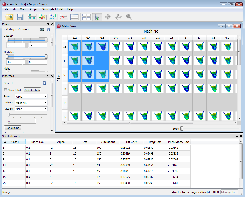
Like any sidebar, the Selected Cases sidebar can be docked to any edge of the Tecplot Chorus workspace; initially, it appears docked at the bottom of the window. Also like any sidebar, it can be "torn off" and dragged out of the main workspace and positioned on any display.
All functions of Table views, except for filtering, can be used with the Selected Cases sidebar, including sorting, rearranging columns, editing values, and deleting cases or variables.
Selecting cases in the Selected Cases sidebar will select these cases in other views, but the cases shown in the sidebar will not change. To change the cases shown in the sidebar, select the cases in another view.
Constraint Visualization with the Selected Cases Sidebar
As with the Table view, cases listed in the Selected Cases sidebar incorporate indicators that show how the displayed cases relate to the filters. Some of these indicators are most useful with Range filters (see Filters for a tour of the types of filters).
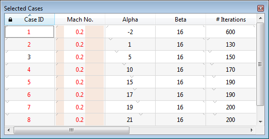
The indicators are:
-
Shading along the left and/or right edges of the cell indicates the proportion of the minimum/maximum values of the filter to the variable’s range.
In the example here, the Mach Number filter (a Range filter) is set to exclude about the lowest 20% and the highest 40% of values. Therefore, about the left 20% and the right 40% of the Mach Number column is shaded.
-
A small, gray downward-pointing tick mark at the top of each cell indicates the position of the cell’s value in the variable’s range. The lowest value has this tick mark placed at the left of the cell, and the highest has it at the right. Other values have the tick mark placed proportionally.
-
Values that violate the filter are colored red; values that pass the filter are colored black. In the example here, the Case ID is subject to a single-value filter and this value is set to 3, which is the only black value in the Case ID column. You can also see that all the visible values in the Mach ID column are being filtered out, as they are red.
