Tecplot 360 EX's three main sidebars provide easy access to frequently-used functionality:
• Plot Sidebar - Includes controls for manipulating the appearance of your plot.
• Pages Sidebar - A list of the pages currently open, allowing you to switch between them, and to create, rename, and delete pages.
• Frames Sidebar - A list of the frames in the current page, allowing you to easily manage their order and other characteristics.
Initially, the Plot and Pages sidebars appear "docked" on the left side of the workspace—attached to the left side of the plot area. The Frames sidebar is initially hidden, but appears on the left side of the workspace when enabled using the View menu.
Any visible sidebar may be moved to the right side of the workspace, or even dragged out of the workspace entirely (for example, to move it to another display) by dragging its title bar.
When more than one sidebar is docked to the same side of the workspace, they can be combined in two ways:
• Tabbed panels - Only one sidebar is visible at a time; tabs appear at the bottom of the sidebar are to choose which sidebar you want to use. This is the default mode; the screen image in “Interface” on page 14 shows how this looks.
• Sharing space vertically - Both sidebars are visible at the same time. You can drag the boundary between the two sidebars to adjust the proportion of the space used by each.
Which style is used depends on where you dock the second sidebar: drag to the top or bottom of the already-docked sidebar to split the area, or drag to the middle to combine them and use tabs to switch between them.
Additional sidebars are available for certain other features throughout Tecplot 360 EX. For example, the Quick Macro Panel is a sidebar that initially appears docked to the right side of the workspace. Like the other sidebars, it may be "torn off" from the window or share space with another sidebar. The Probe Sidebar is another; it displays the results of probe operations.
Any sidebar may be closed if it is in your way. To open it again, choose the desired sidebar from the appropriate menu, or right-click any sidebar or the menu bar and choose the desired sidebar from the context menu.
|
Sidebar |
Menu Command |
|---|---|
|
Plot |
View>Plot sidebar |
|
Pages |
View>Pages sidebar |
|
Frames |
View>Frames sidebar |
|
Probe |
Data>Probe sidebar |
|
Quick Macro Panel |
Scripting>Quick Macros |
The controls available in the Plot sidebar depend on the plot type of the active frame. For 2D or 3D Cartesian plot types, you can show or hide zone layers, and zone effects, and derived objects from your plot. For line plots (XY and polar) you can show or hide mapping layers.
You can open the Plot sidebar from the View menu if it is not currently visible. To customize your plot, simply:
• Select a plot type from the Plot Types drop-down menu.
• Use the toggle switches to add or subtract Zone Layers/Map Layers, or Zone Effects, or Derived Objects. Use the Zone Style/Mapping Style dialogs to further customize your plot by showing or hiding zones in specific plot layers/mappings, changing the way a zone or group of zones is displayed, or changing various plot settings.
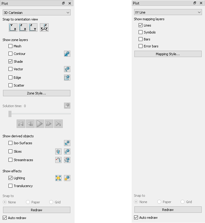
Figure 1-1. The Plot sidebar as it appears for a 3D Cartesian plot (left) and XY Line plot (right).
The Plot Type, combined with a frame's dataset, active layers, and their associated attributes, define a plot. Each plot type represents one view of the data. There are five plot types available:
• 3D Cartesian - 3D plots of surfaces and volumes.
• 2D Cartesian - 2D plots of surfaces, where the vertical and horizontal axis are both dependent variables (i.e. x = f(A) and y = f(A), where A is another variable).
• XY Line - Line plots of independent and dependent variables on a Cartesian grid. Typically the horizontal axis (x) is the independent variable and the y-axis a dependent variable, y = f(x).
• Polar Line - Line plots of independent and dependent variables on a polar grid.
• Sketch - Create plots without data such as drawings, flow charts, and viewgraphs.
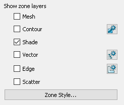 A layer is a way of representing a frame's dataset. The complete plot is the sum of all the active layers, axes, text, geometries, and other elements added to the data plotted in the layers. The six zone layers for 2D and 3D Cartesian plot types are:
• Mesh - A grid of lines connecting the data points within each zone.
• Contour - Iso-valued lines, the region between these lines can be set to contour flooding.
• Shade - Used to tint each zone with a solid color, or to add light-source shading to a 3D surface plot. Used in conjunction with the Lighting zone effect you may set Paneled or Gouraud shading. Used in conjunction with the Translucency zone effect, you may create a translucent surface for your plot.
• Vector - The direction and magnitude of vector quantities.
• Edge - Zone edges and creases for ordered data and creases for finite element data.
• Scatter - Symbols at the location of each data point.
Zone Style
Select the [Zone Style] button to launch the Zone Style dialog. The Zone Style dialog is used to customize the zone layers that you have added to your plot. Refer to the chapter for each zone layer for details on working with the Zone Style dialog.
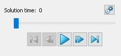 When working with transient data, simply press the Play
  button in the Plot sidebar to animate over time. The active frame will be animated from the Current Solution Time to the last time step. You may also drag the slider to change the Current Solution Time of your plot.
The Animation Controls have the following functions:
•  – Jumps to the Starting Value. (Keyboard: Home)
•  – Jumps toward the Starting Value by one step. (Keyboard: Left arrow)
•  – Runs the animation as specified by the 'Operation' field of the Time Details dialog. The Play button becomes a Pause button while the animation is playing. (Keyboard: Space bar)
•  – Jumps toward the Ending Value by one step. (Keyboard: Right arrow)
•  – Jumps to the Ending Value. (Keyboard: End)
Use the  button to launch the Time Details dialog.
See Section 7 - 2 “Time Aware” for more information on Time controls and the Time Details dialog.
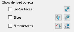 For Cartesian plot types (2D and 3D): Toggle-on Iso-surfaces, Slices, or Streamtraces from the Plot sidebar to add any or all of these elements to your plot. For convenience, the tool buttons for Slices and Streamtraces also appear here. The Details dialogs for each of the derived objects can be accessed via their respective buttons (
 ,
,  ,
,  ). Refer to Chapter 16: “Iso-surfaces”, Chapter 14: “Slices”, or Chapter 15: “Streamtraces” for details on working with these objects.
For 3D Cartesian plot types, use the Plot sidebar to turn lighting and translucency on or off. Only shaded and flooded contour surface plot types are affected. Refer to Chapter 12: “Shade Layer” and Chapter 13: “Translucency and Lighting” for additional information.
 A layer is a way of representing a frame's dataset. The complete plot is the sum of all the active layers, axes, text, geometries, and other elements added to the data plotted in the layers.
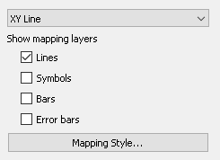
The four XY Line map layers are:
• Lines - Plots a pair of variables, X and Y, as a set of line segments or a fitted curve.
• Symbols - A pair of variables, X and Y, as individual data points represented by a symbol you specify.
• Bars - A pair of variables, X and Y, as a horizontal or vertical bar chart.
• Error Bars - Allows you to add error bars to your plot.
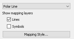 The two map layers for Polar Line are:
• Lines - A pair of variables, X and Y, as a set of line segments or a fitted curve.
• Symbols - A pair of variables, e.g. X and Y, as individual data points represented by a symbol you specify.
Select the [Mapping Style] button to launch the Mapping Style dialog. The Mapping Style dialog allows you to customize the style settings for each of the plot layers and specify the points to plot. The pages of the dialog are discussed in detail in Chapter 6: “XY and Polar Line Plots”.