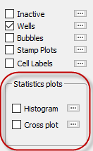
 Tecplot RS’s statistical plots, histograms and cross plots, graph the distribution of grid data, enabling you to analyze your data in a visually meaningful way. Accessible by choosing Histogram or Cross Plot from the Analyze menu, using the options on the sidebar, or using buttons on the toolbar, both of these analysis methods open a smaller frame next to your grid plot that displays the analysis data. When you display a histogram or cross plot, Tecplot RS will resize the plot frame to add the analysis frame. If you have multiple frames shown, Tecplot RS will resize only Frame 1.
 When you choose the Histogram from the Analyze menu or by clicking the toolbar button, the Histogram dialog appears. You can show or hide the histogram plot using the Show checkbox in the dialog or by using the Quick Stats checkbox in the sidebar. For your convenience, you may also switch between the histogram and cross plot using the radio buttons at the top of the dialog.
The histogram displays the frequency with which different values of the chosen variable occur. You can change the variable used by choosing a different item in the Variables list in the sidebar. The histogram updates automatically whenever you change a setting.
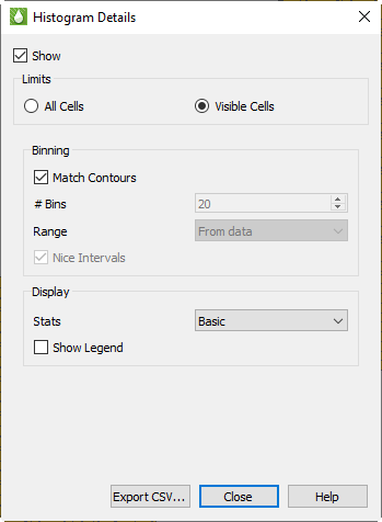 The Histogram dialog has the following options:
• Limits You can choose to perform calculations on All Cells in the model, or on only those Visible in the current view.
When Visible Cells is selected for 3D Grid plots, you can control which cells are included in the analysis via the Inside Views option in the sidebar and also the Cell Blanking options (both Pick and Value Blanking).
Grids with LGRs use blanking internally. Cells are blanked in the parent grid where they are replaced by the LGR. Keep this in mind when choosing the All vs. Visible option, since it will affect the cell count.
In 2D Grid plots, the All Cells computations are limited to the single layer being displayed, and Visible Cells can be further limited by Cell Blanking.
• Binning Histogram data are grouped into bins, with each bin counting the number of cells that fall into a defined range. The Binning options allow you to control the number and range of the bins.
With Match Contours on, the bins match the contour levels used in the current plot and the legend shown in the plot frame. Each bar of the histogram that represents the count of the number of cells in that range will also be colored to match the cell color in the main plot. Since you can customize the contour legend for each variable using Plot Options, your histogram bins and coloring may change when you choose a different variable. In addition, the Plot Options controls will allow you to set up log scales, different color maps, and custom ranges on a variable-by-variable basis. If you make a change in Plot Options for the plot legend, that change will also be reflected in the histogram plot.
|
|
 Double-click the legend in the plot frame to be taken directly to Plot Options and the options for the legend for the current variable..
If you want different bins for your histogram without changing the contours in the main plot, turn off the “Match Contours” checkbox to activate controls that allow you to set bins manually by specifying both the number of bins and the range covered.
• Display These settings control the display of additional information in the histogram frame.
• Show Legend Turns on a legend in the histogram frame showing the bin levels and colors. This is similar to the legend shown in the data frame, except the histogram legend is always drawn vertically.
• Stats Choose None, Basic, or Complete. Basic info includes Min, Max, Mean, and Standard Deviation. Complete info adds Median and Quartiles. These data are displayed as text at the top of the analysis frame.
• Export CSV... button Click this button to export histogram data as a comma separated data file (CSV).
|
|
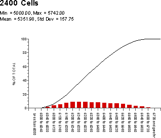
The example histogram shown here uses the Match Contours option for bins and Basic statistics. The Show Legend option is on.
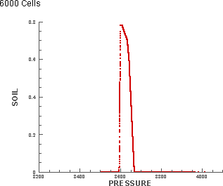
Like histograms, cross plots also graph the distribution of a data set, giving you another method of visualizing the arrangement of your data. In a cross plot, instead of a number of bins distributing the data, the distributed relationship between two, three, or four variables is shown as a scatter plot.
For example, the following plot compares Pressure and Oil Saturation (SOIL) in 6000 cells. With each symbol on the plot representing one of the cells, the display shows that the majority of oil saturation occurs in the cells with a pressure value between 3500 and 3700.
 When you choose the Cross Plot function from either the Analyze menu or by clicking the toolbar button, the Quick Stats dialog appears in Cross Plot mode. You can show or hide the cross plot using the Show checkbox in the dialog or by using the Quick Stats checkbox in the sidebar. For your convenience, you may also switch between the histogram and the cross plot using the radio buttons at the top of the dialog.
The cross plot automatically updates when you change the settings in the dialog.
The Quick Stats dialog includes the following options when in Cross Plot mode: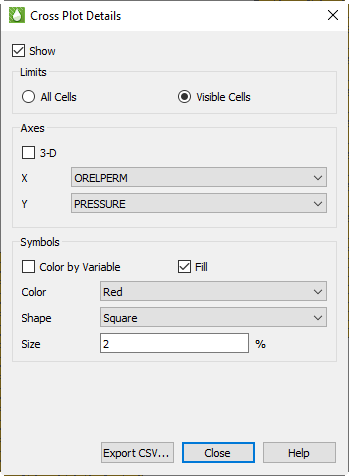
• Limits You can choose to perform calculations on All Cells in the model, or on only those Visible in the current view.
When Visible Cells is selected for 3D Grid plots, you can control which cells are included in the analysis via the Inside Views option in the sidebar and also the Cell Blanking options (both Pick and Value Blanking).
In 2D Grid plots, the All Cells computations are limited to the single layer being displayed, and Visible Cells can be further limited by Cell Blanking.
• Axes In the Axes section of the dialog, you can choose which variables to compare on the cross plot. You can choose two variables for a 2D plot, and a third variable when you enable the 3D option.
• Symbols In the Symbols section, you can customize the symbols displayed on the cross plot by choosing the symbol color, shape, size, and fill option.
You also have the option to Color by Variable, allowing you compare a third or fourth variable on the plot. When this option is checked, you choose a variable name instead of color, and the symbols will be colored just as contours are shown in the grid plot. A separate legend is displayed in the cross plot frame to indicate the color scale.
• Export CSV... button Click this button to export cross plot data as a comma separated data file (CSV).
|
|
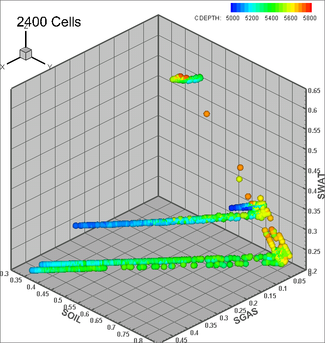
In the example cross plot here, four different variables are compared (one on each of three axes and the fourth by color).